DEMO REEL

Animations I made using a variety of different mediums such as Stop Motion, After Effects, Cinema 4D, and Procreate!
Photos from my travels around the world! From Antartica, to Asia, to even Africa, I've had a wonderful time taking pictures of interesting landscapes an wildlife!
Numerous graphic design work I've done throughout the years. From style frames, to typography, to brand design.
Hi! I’m Sophia. I am a Motion Design student at Ringling College of Art and Design. I grew up in Ohio but currently live in Florida. I enjoy making art that is plain in its imaging, but if you look closer there is usually a hidden meaning. I usually enjoy making my art in 3D with Cinema 4D, but I also enjoy using the adobe suite to create fun design and animations.When not doing art I enjoy playing with my dog and taking him for walks. I'm also an avid fan of reading novels, particularly ones filled with action. In addition to digital art, I enjoy traveling and photography, usually taking pictures of live animals.
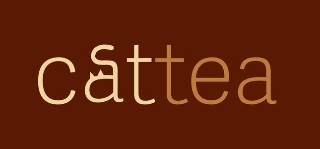
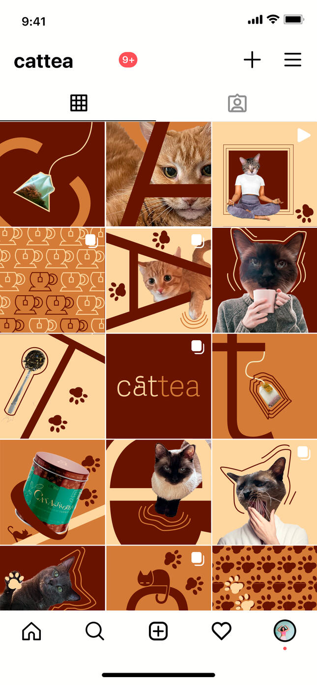
Cattea brand design

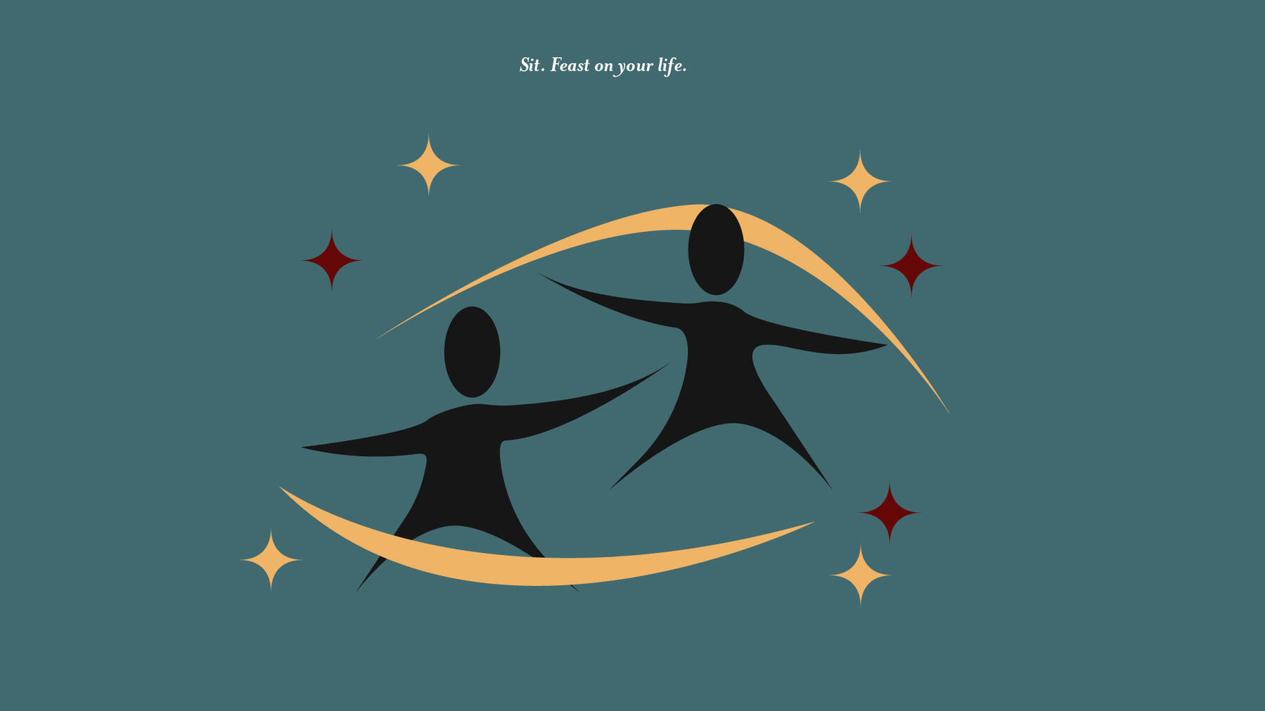
Love after Love
Derek Walcott
Experimental Styleframe

Nike Style Frames
Brand StyleFrame Dev

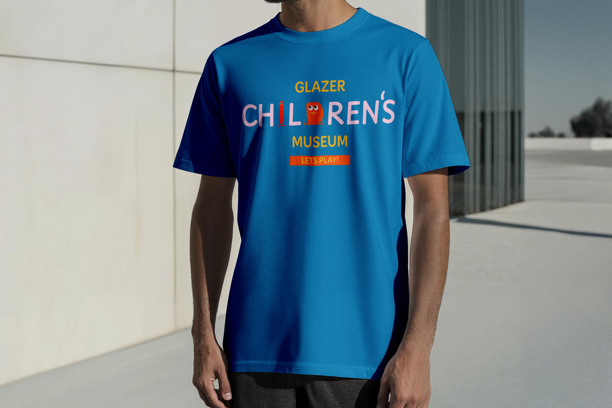
Glazer Children's Museum Redesign

Apple Headphone Promotion


Moving posters
Sophia Onysko Brand

Styleframe Story Practice
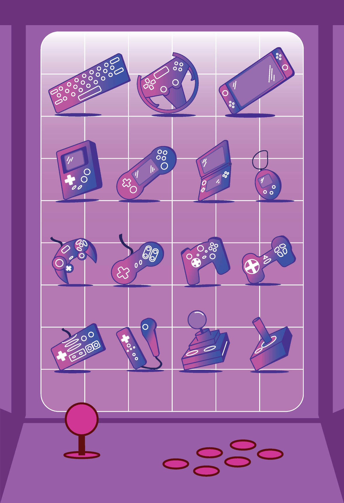
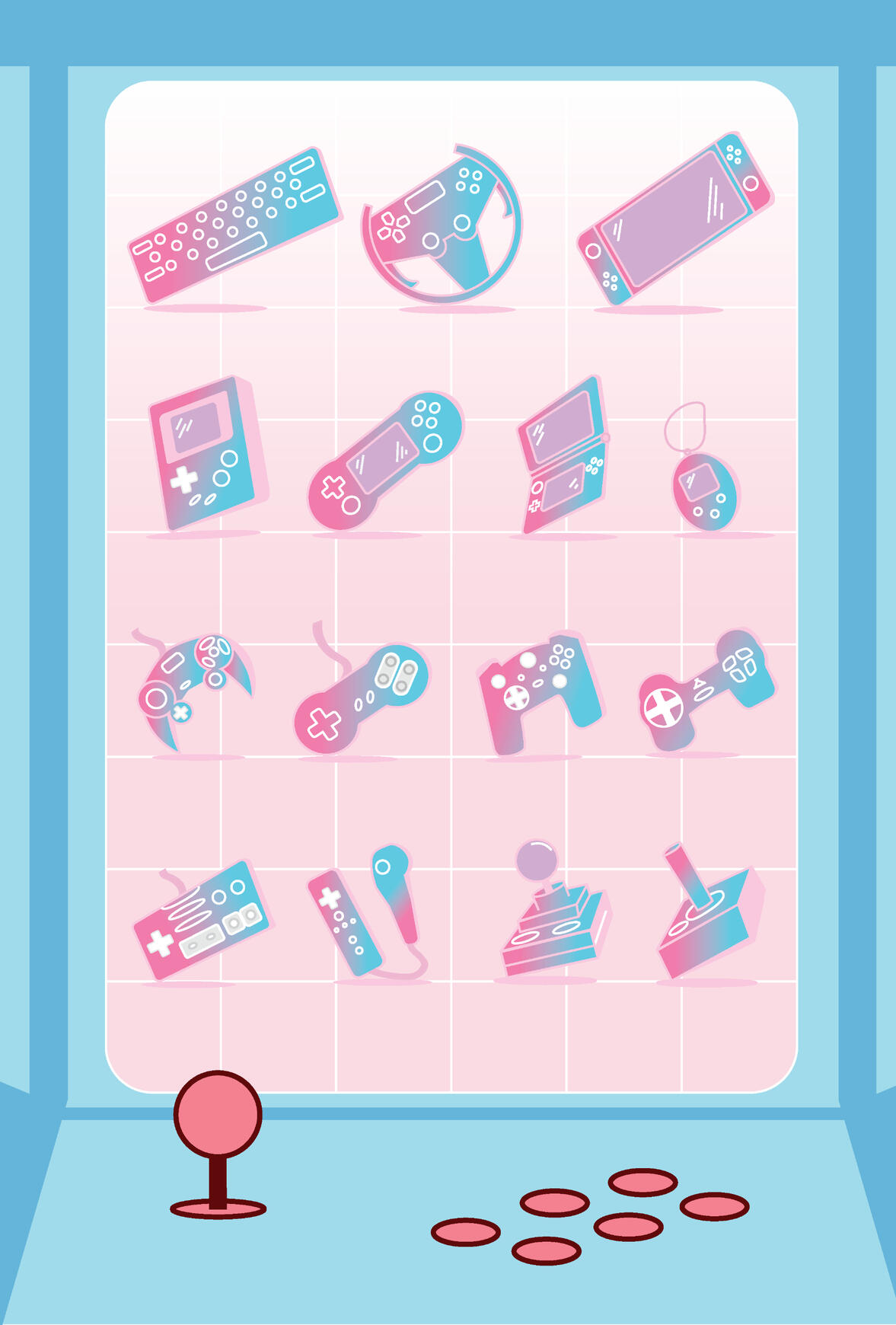
Icon Packet/Poster


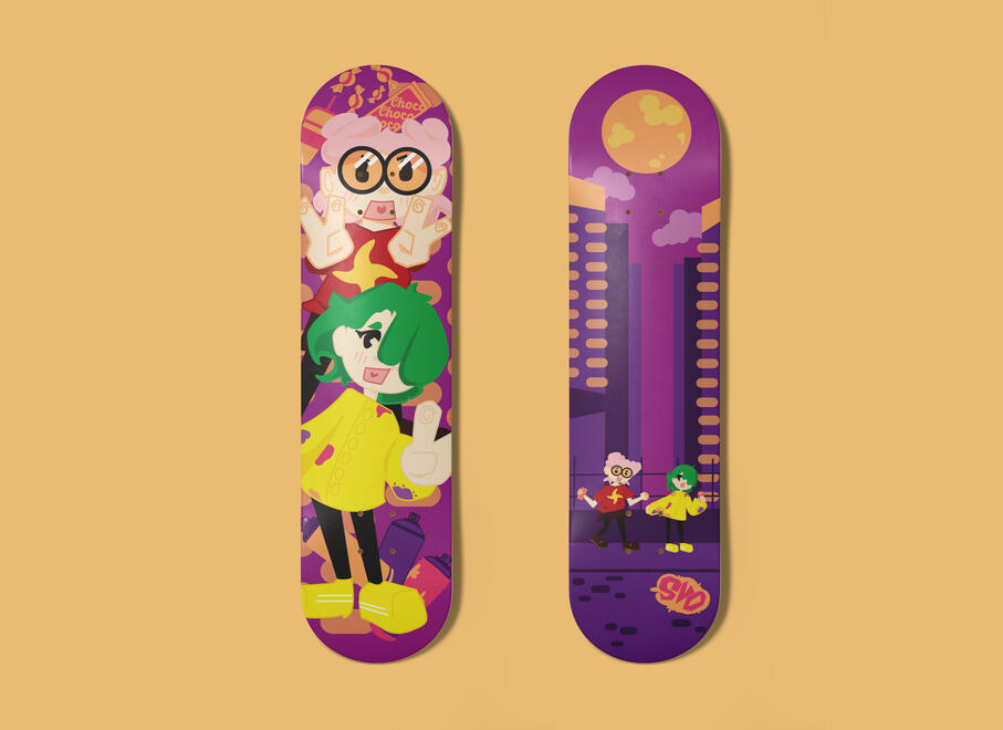
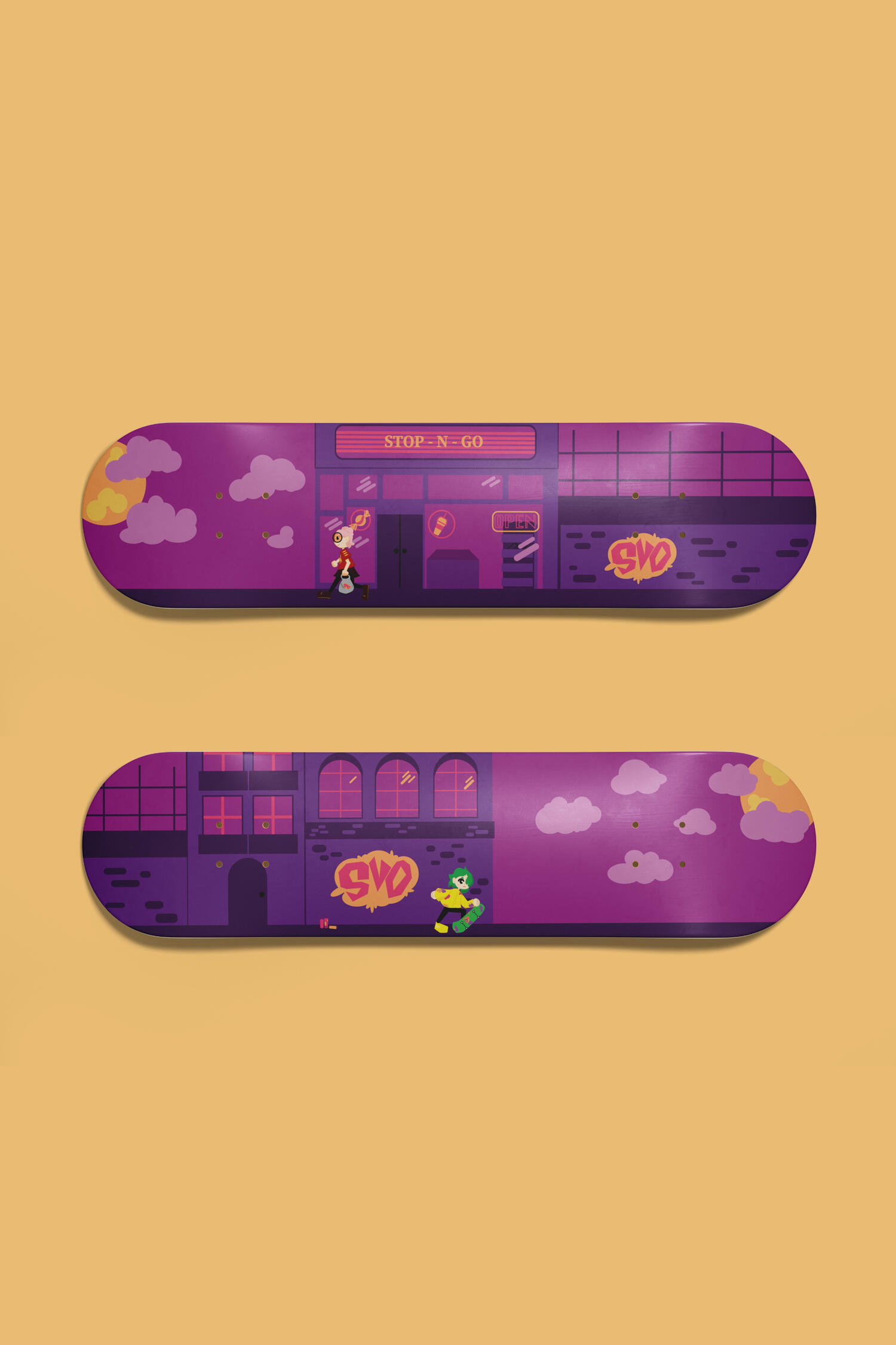
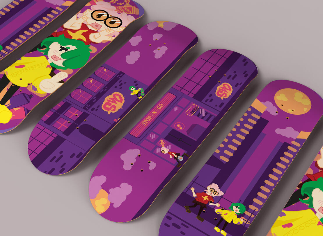
Skateboard Designs
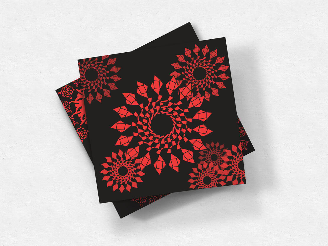
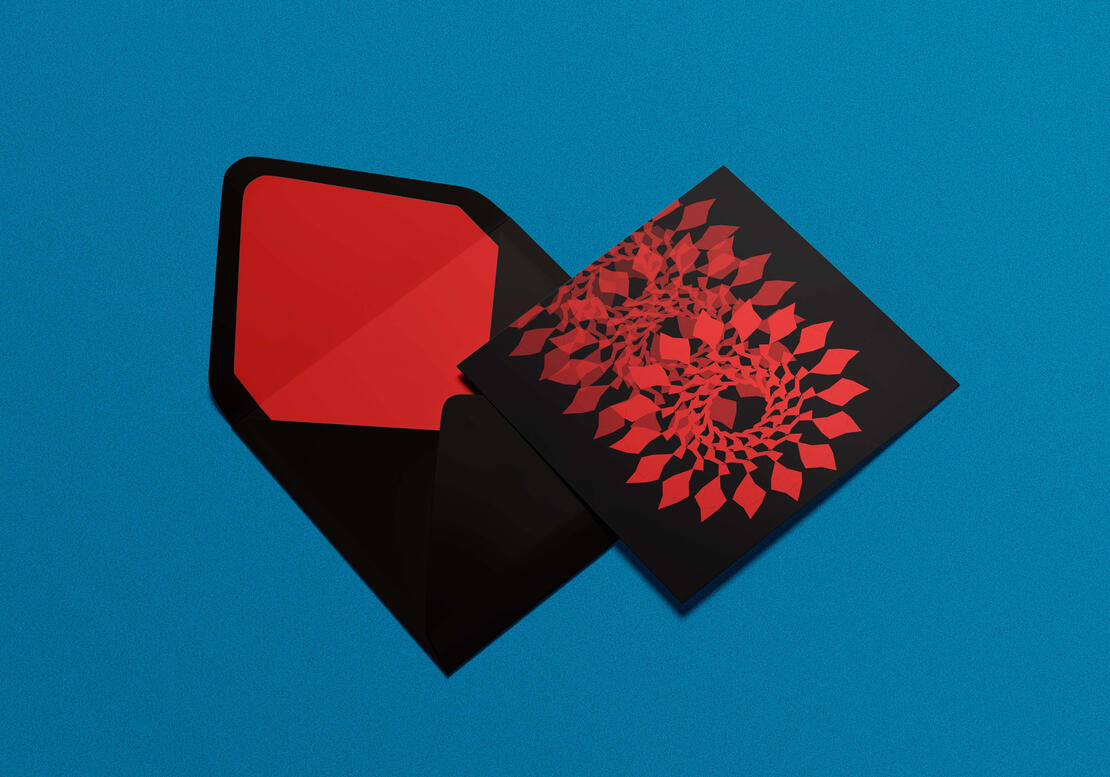
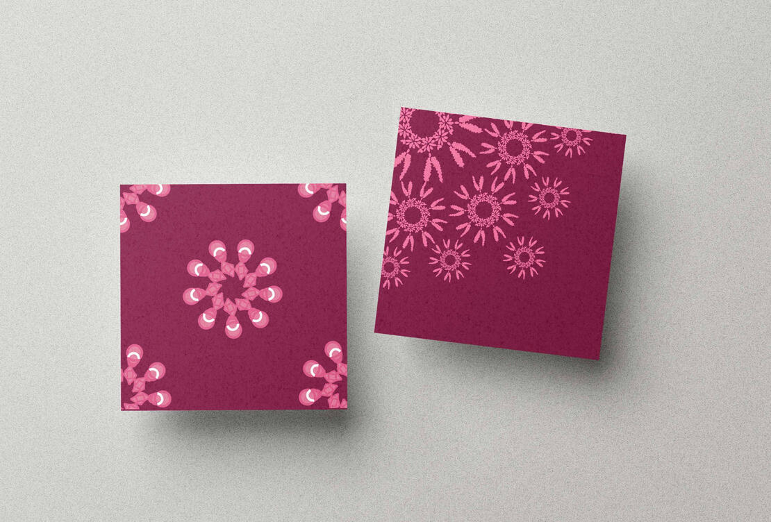
Card Designs
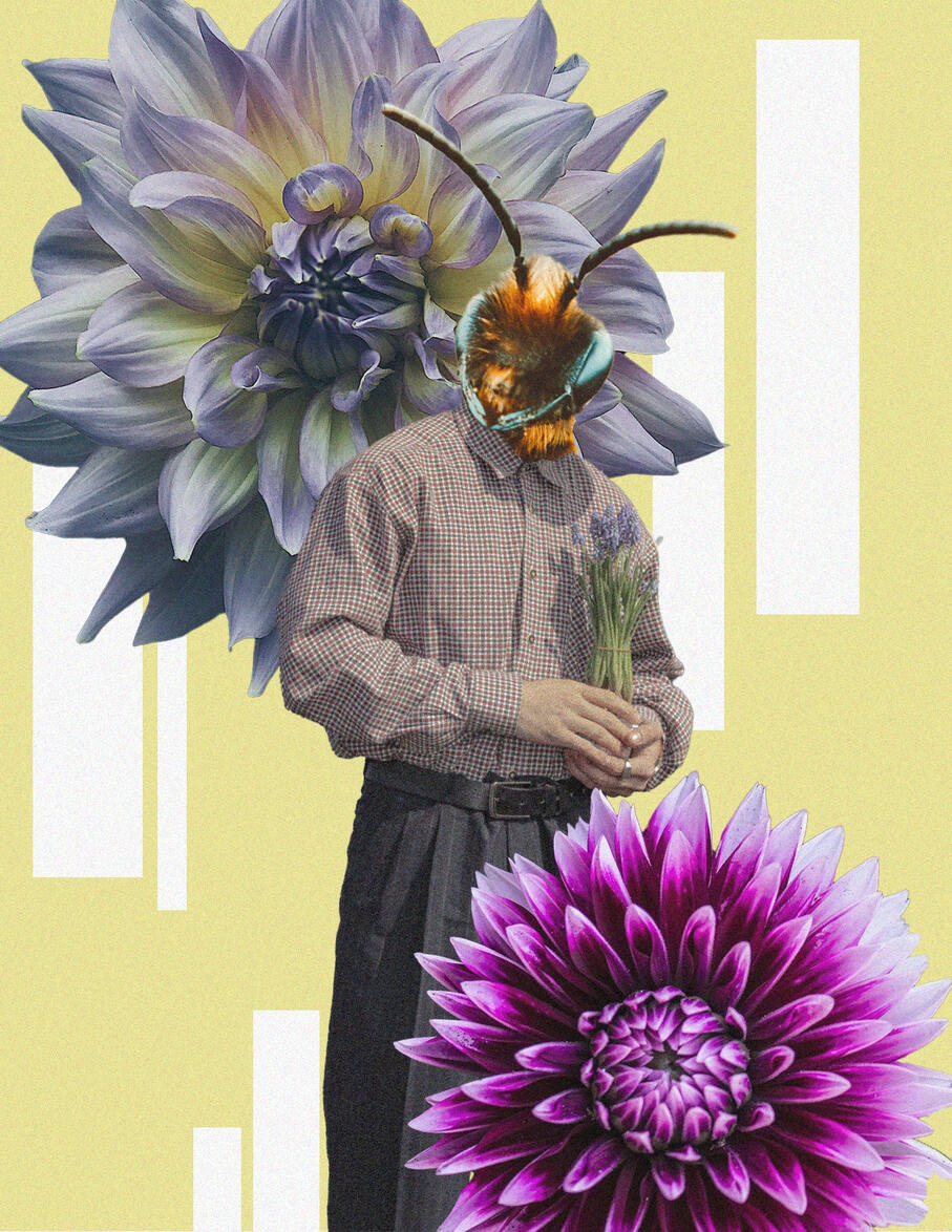
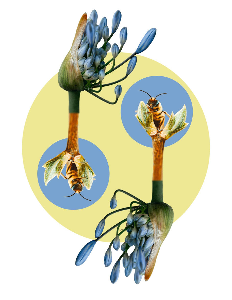
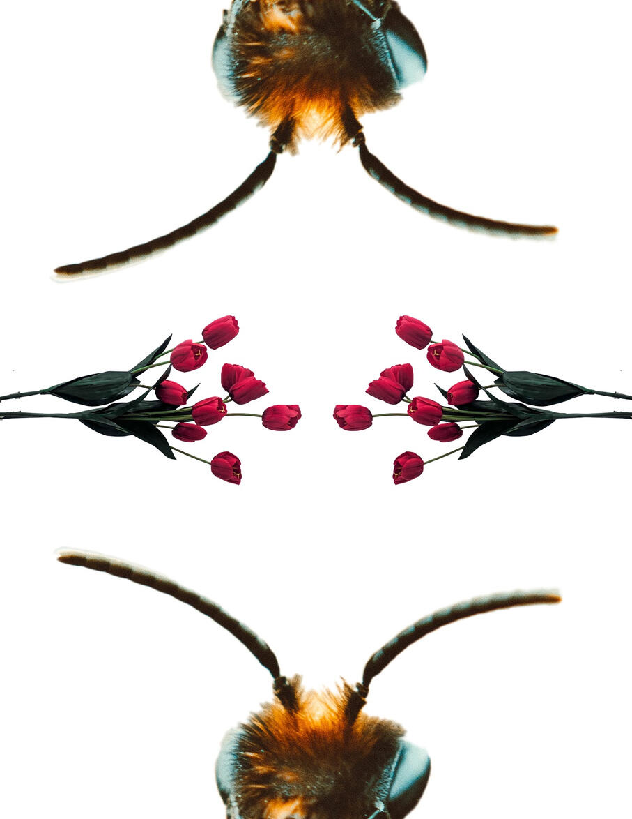
Collage
THE 12 PRINCIPLES OF ANIMATION

SARASOTA FRESH FRIDAY
MOTION DESIGN MIXER
ABSTRACT TITLE SEQUENCE
THE LAUGHING HEART


Antartica, Falkland Islands, South Georgia 2025 - 2026


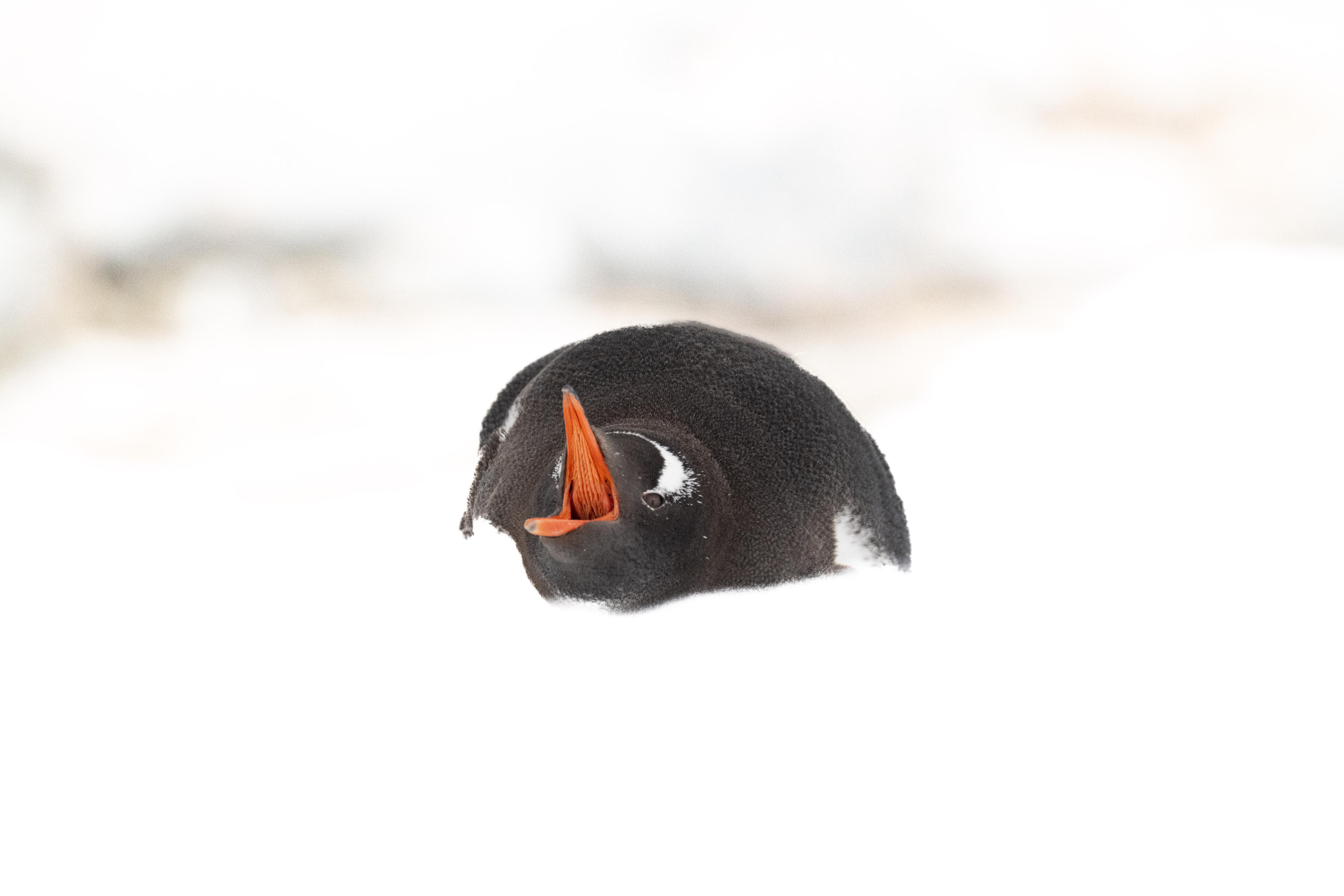
Africa 2025


Africa 2023


Japan 2020


Bhutan 2018


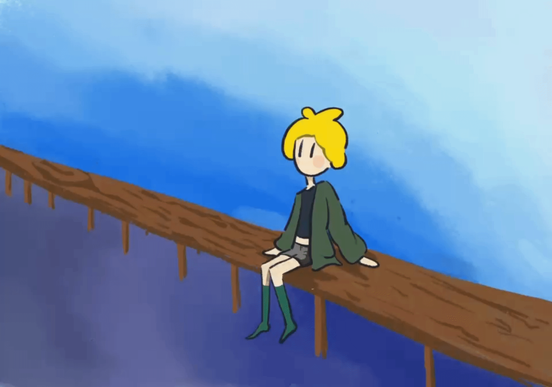
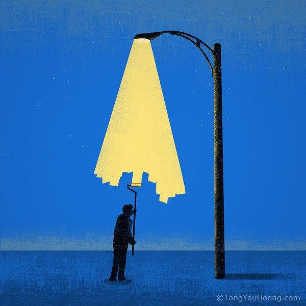
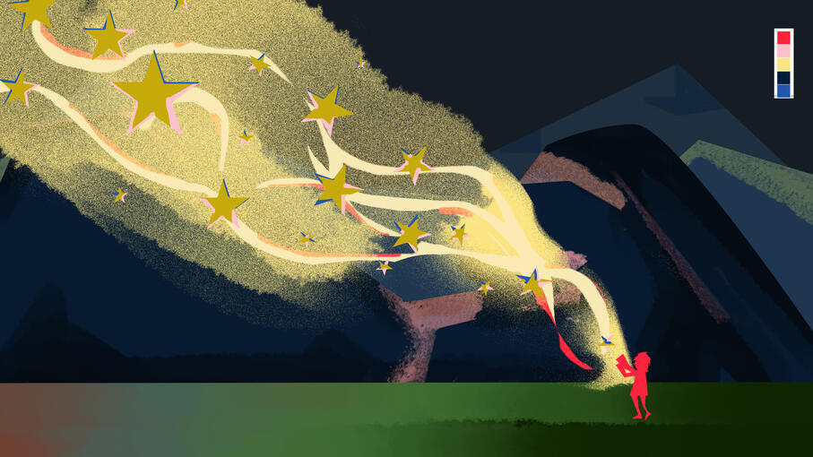
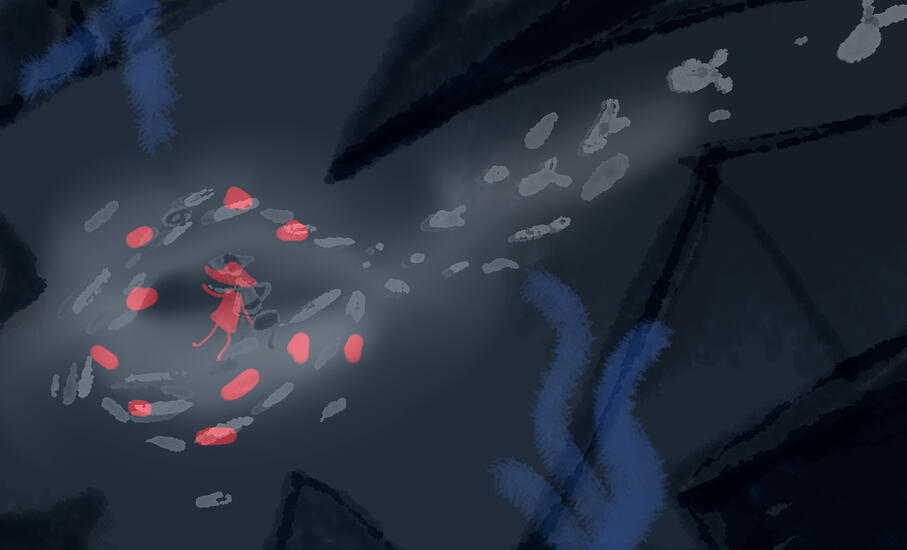
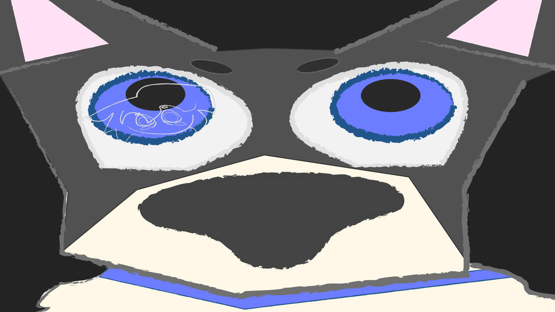
The Laughing Heart
The Laughing Heart was a project that challenged matching visuals to a story. For my design I was highly focused on the part of the narrative that mentioned how people can find their way out no matter how little light there is. I wanted to tell a story that slowly went from darkness to light, and automation to humanity. A story of how a little bit of light can move from being just that to being a supernova that defeats the darkness.
Boardomatic
Style Frames


Abstract Title Sequence
Sacred Algorithm - Codes of creation
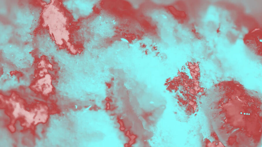
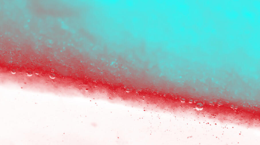
Abstract Title Sequence was a project that challenged the use of real world objects and abstract them to make them unrecognizable. After that I had to use them to create a title sequence that revealed in the end what the project was.
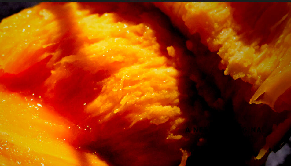
The first part of this process was to gather the objects I was going to make abstract. In this case I chose an object that could look wet and unlike itself when it was zoomed into greatly - fruit!
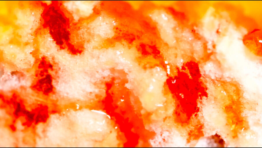
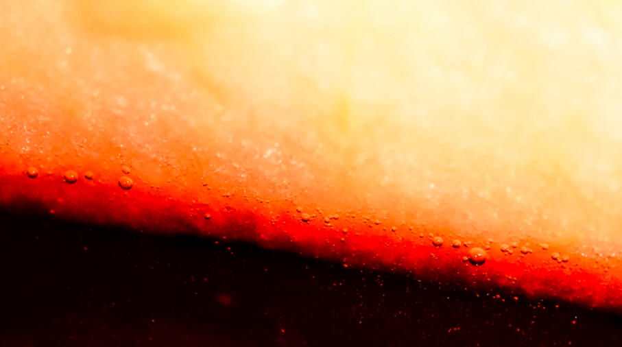
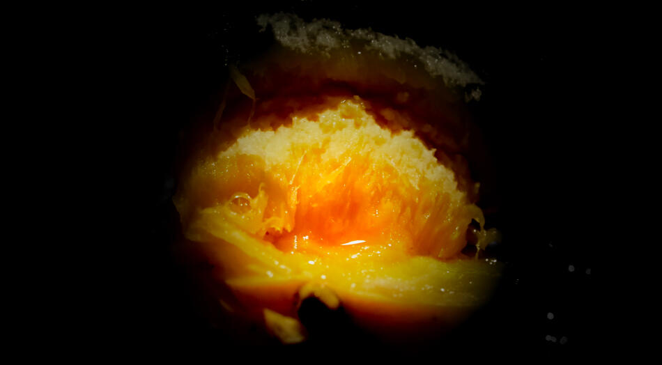
After that it was the process of color grading it to get that technological look that I wanted to display in the title sequence.
THE FONT
For this project I decided to use the font DIN 2014. While it may seem like a classic font, the geometric and sleek look bring the type of sci-fi look I wanted in this piece. That placed with the type displacement filter adds more of a dystopian look to it.

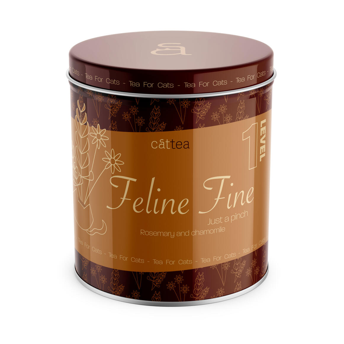
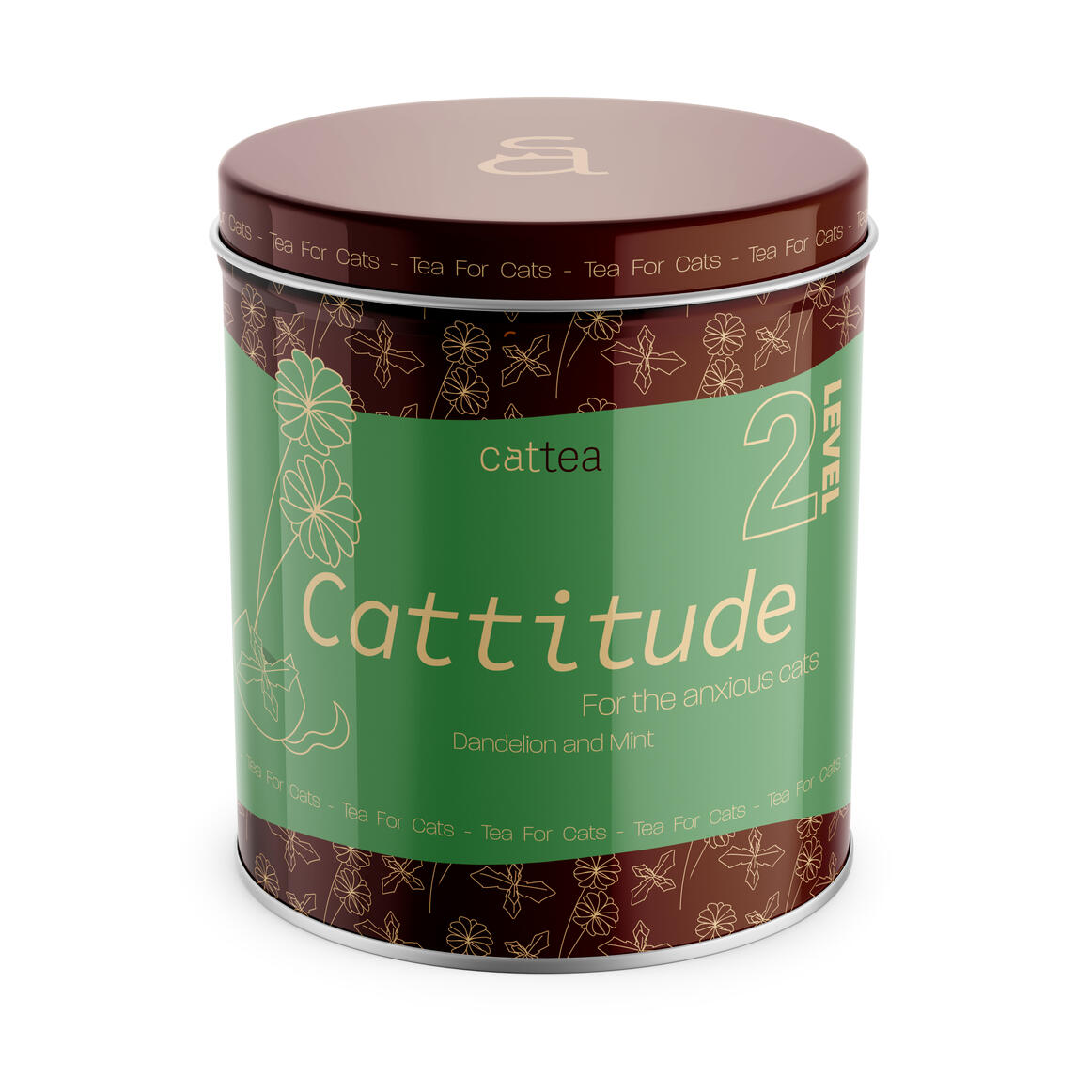
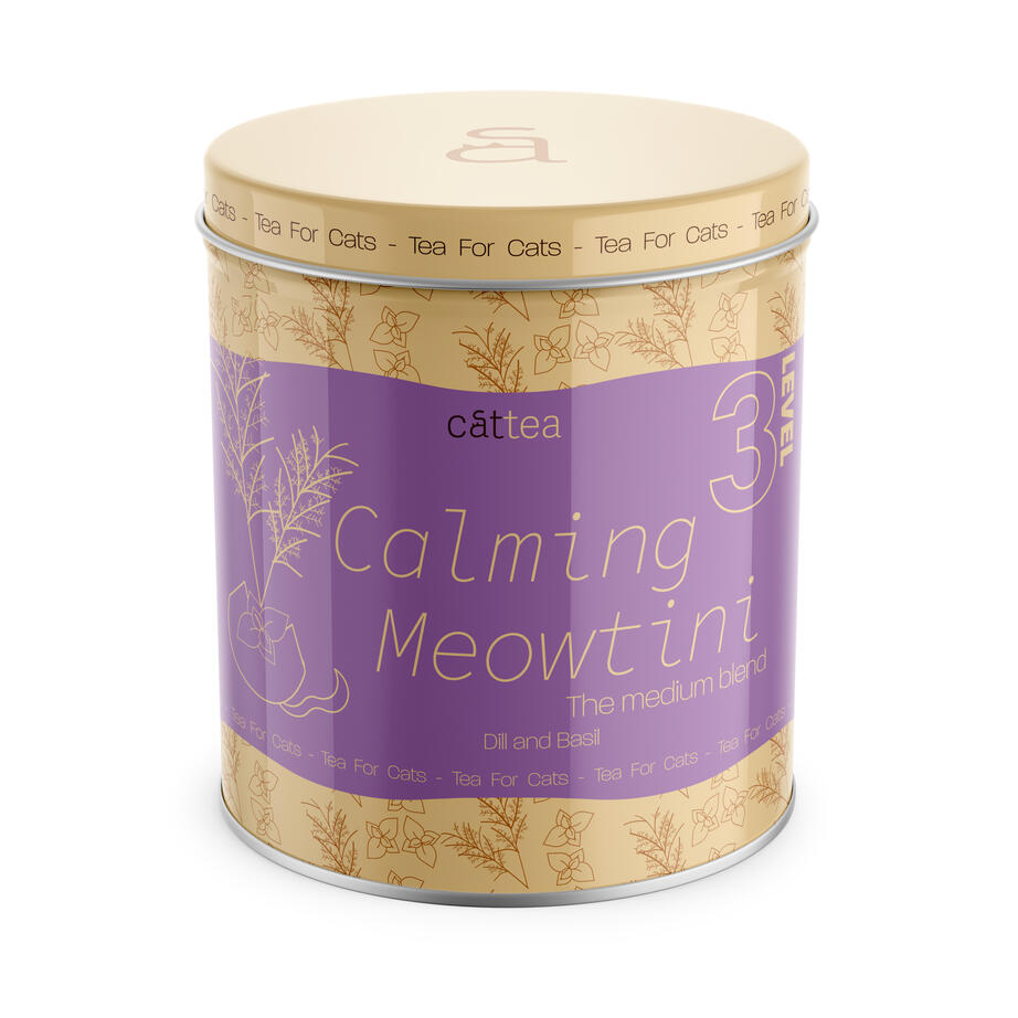
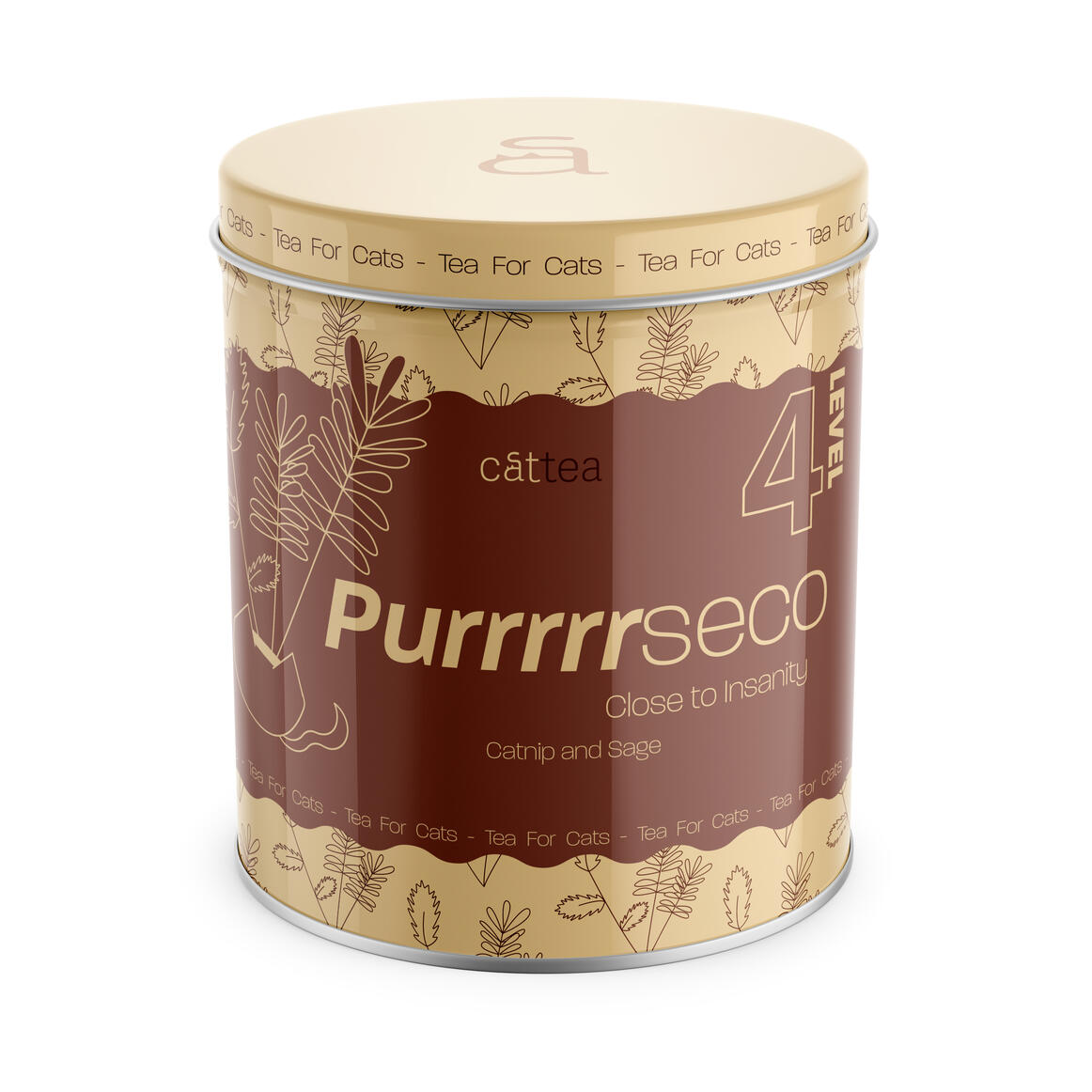
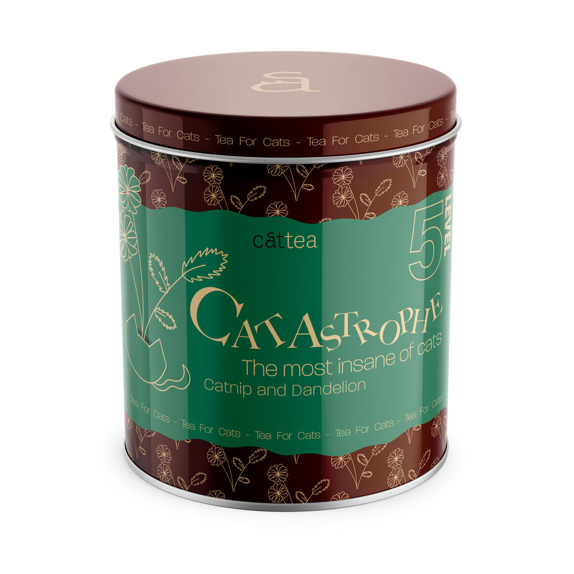
Cattea Brand Design
BEHANCE LINK FOR SHORTER OVERVIEW:
https://www.behance.net/gallery/224421031/Cattea-Brand-Design
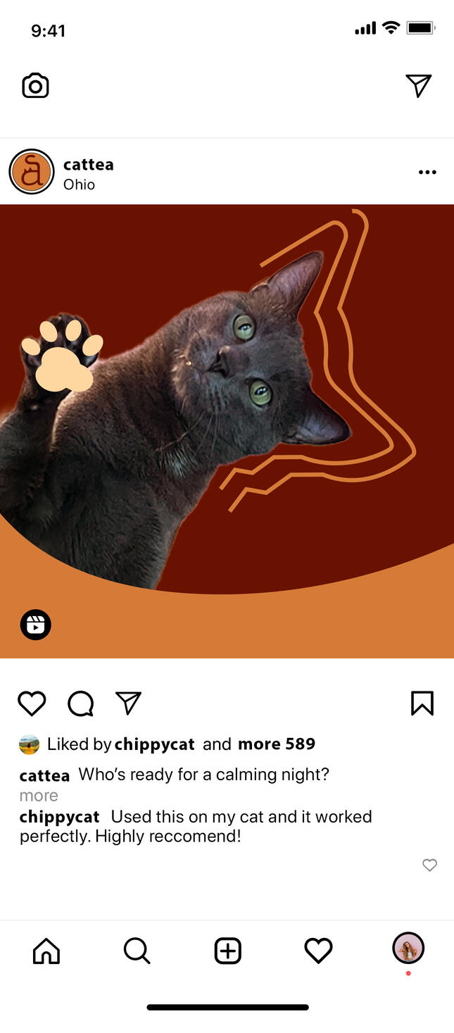
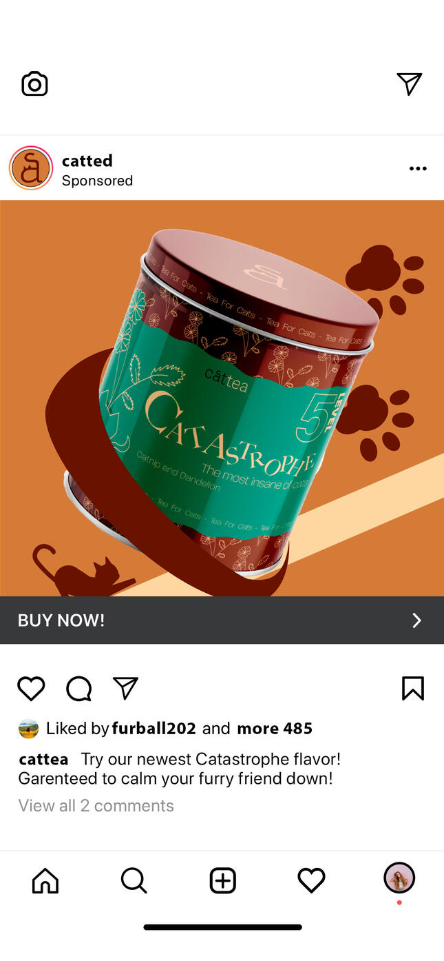
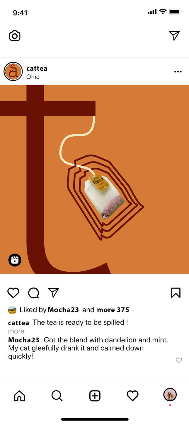
This project was all about branding; creating, designing, and explaining why you made specific decisions. For my project I created a fictional business that catered to cat owners that have overly exited or anxious cats.
THE LOGO:
By far the most important part of a brand is the logo. I had a clear vision of the logo to be more simplistic to contrast the chaotic feel of the product and social media design.
While the original logo design is interesting and says enough about the design, it was pretty easy to simplify it for recognition. The recognizable "a" in the sentence Cattea was perfect for it, and can be seen on top of the can.

SOCIAL SQUARES:
This project turned out to be a very maximalist style. Bold patterns with large assets to draw the viewers eye. It gave more of a wacky feeling than more serious feeling. This can be seen with the social media squares that I had to make. Using a mix of collage with assets seen in the brand design; it really created a more chaotic feeling.
PRODUCT DESIGN:
The tins that Cattea is produced in is designed with fun patterns that symbolize what ingredients were used in the tea, and calming colors to demonstrate what the product is meant to do. From level 1-5 the boarder around the text gets more wavy as the level goes up to demonstrate what kind of cat it's meant for.
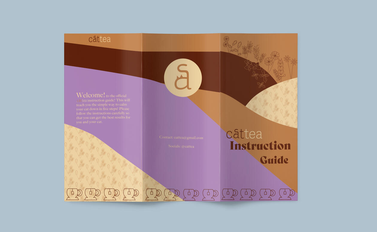
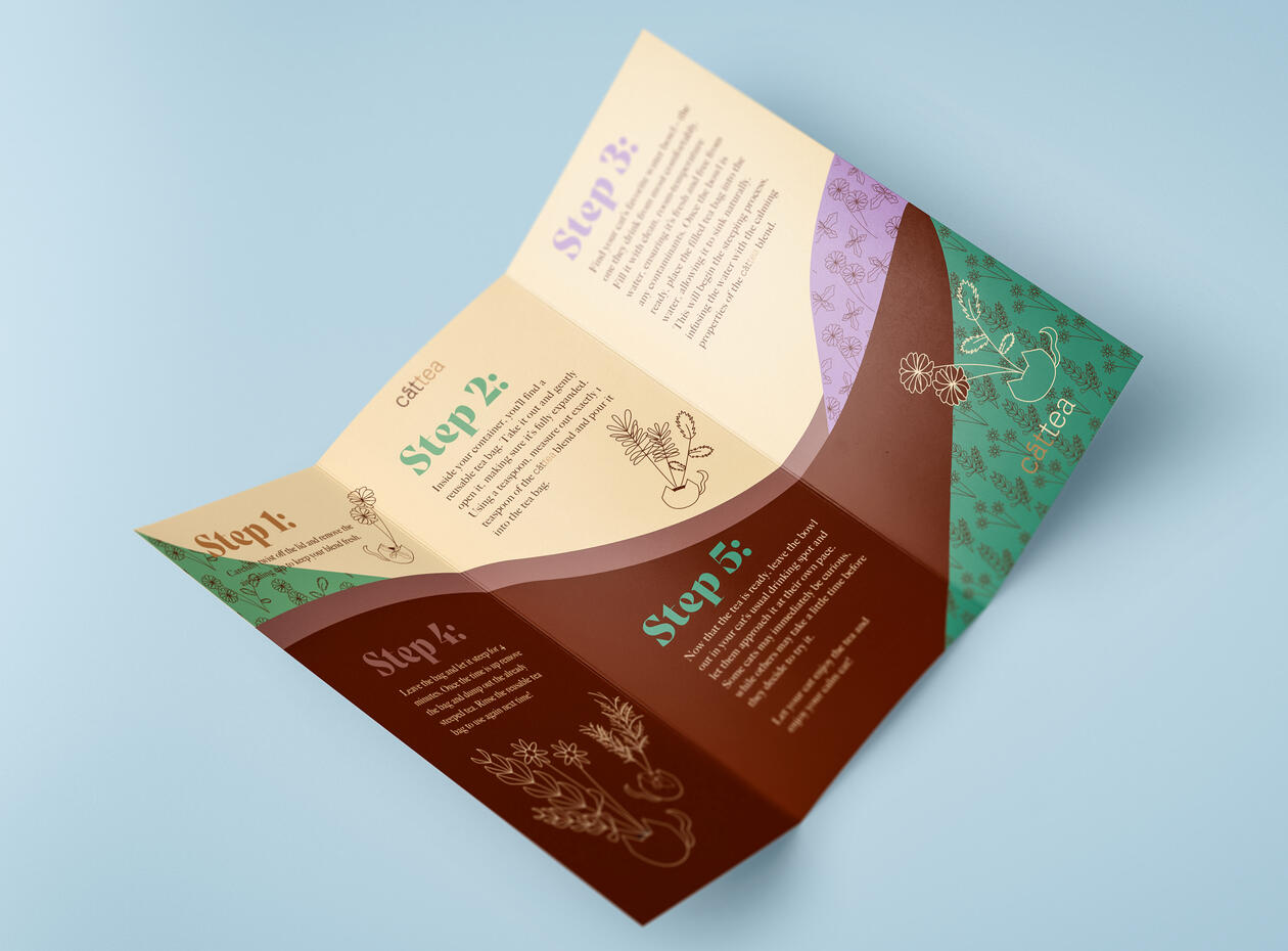
BROCHURE DESIGN:
For an extra part of this project I decided to design a brochure to tell the user how to, well, use this product. Filled with all the patterns seen before, this is a bold brochure that both draws the viewer in and is informative as well.
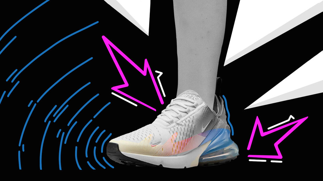
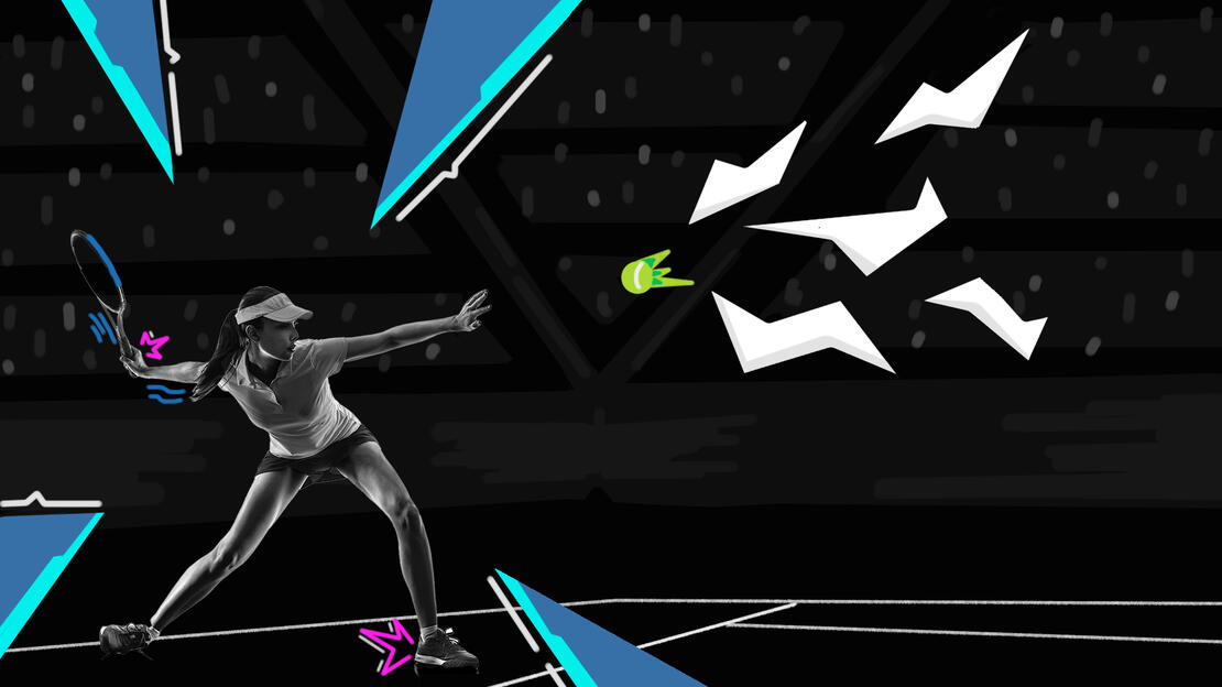
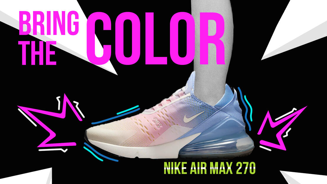
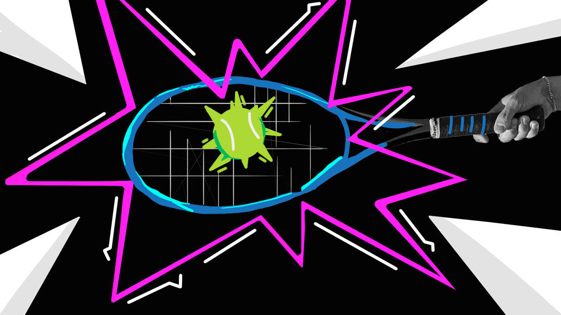
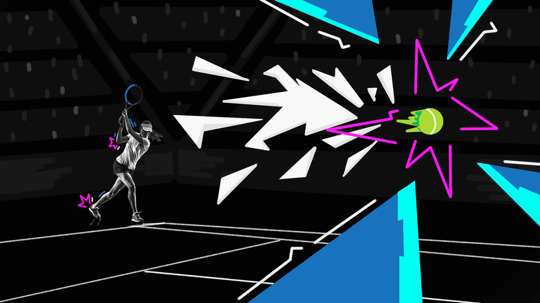
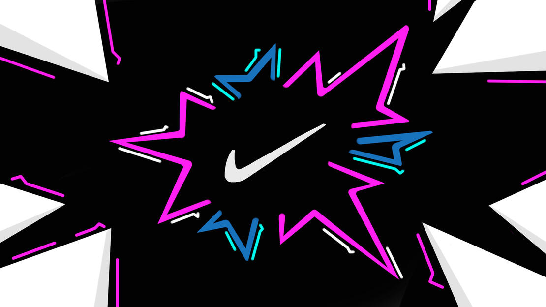
Nike Style Frames
This project was meant to create style frames with a specific brand in mind. In this case, the brand was Nike. I had to choose a shoe and make an ad that went through a story for the reveal of the whole shoe. I wanted to show how using the shoe brought color into the users life and so I went with a bright colors and a more monochrome background.

The Project
This project was based on the idea of clearly conveying a mood / theme through the use of one style frame. For this project I wanted to convey the feeling of something or someone rising against a indomitable force, or hope emerging from decay.
The Insperation
For this project I wanted to use colors to convey hope rising above the darkness. To do that I used cool and dark colors in the background, so alone they would convey a sense of hopelessness.In comparison, by using bright, warm colors , it conveyed the hope really well. In addition it also brought a nice contrast to the piece as well.
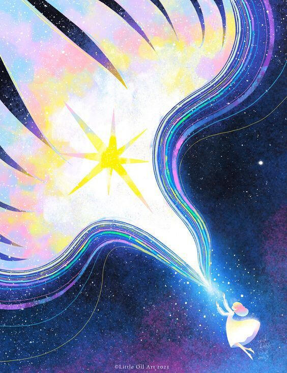
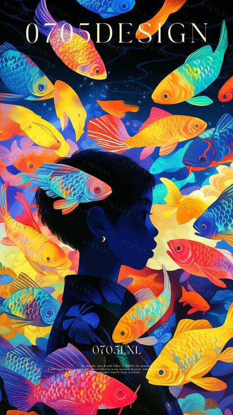
In addition to the contrasting colors, I also wanted to add a motif that seemed 'freeing'. For that I had to decide between fish or stars. In the end I decided to go with stars so that it could convey a sense of rising into the sky rather then pushing against the current like it would seem in the water.
The Beginning ideation
For this project in particular I had a rough time with coming up with ideas that didn't involve humans. I usually do not have a lot of trouble with this, but this project was deceptively simple which is why it took me so long to come up with the end product. When I finally realize I was thinking too hard I came up with the simplest idea of just making the main 'character' a ball.

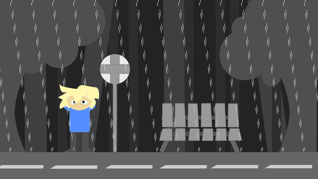
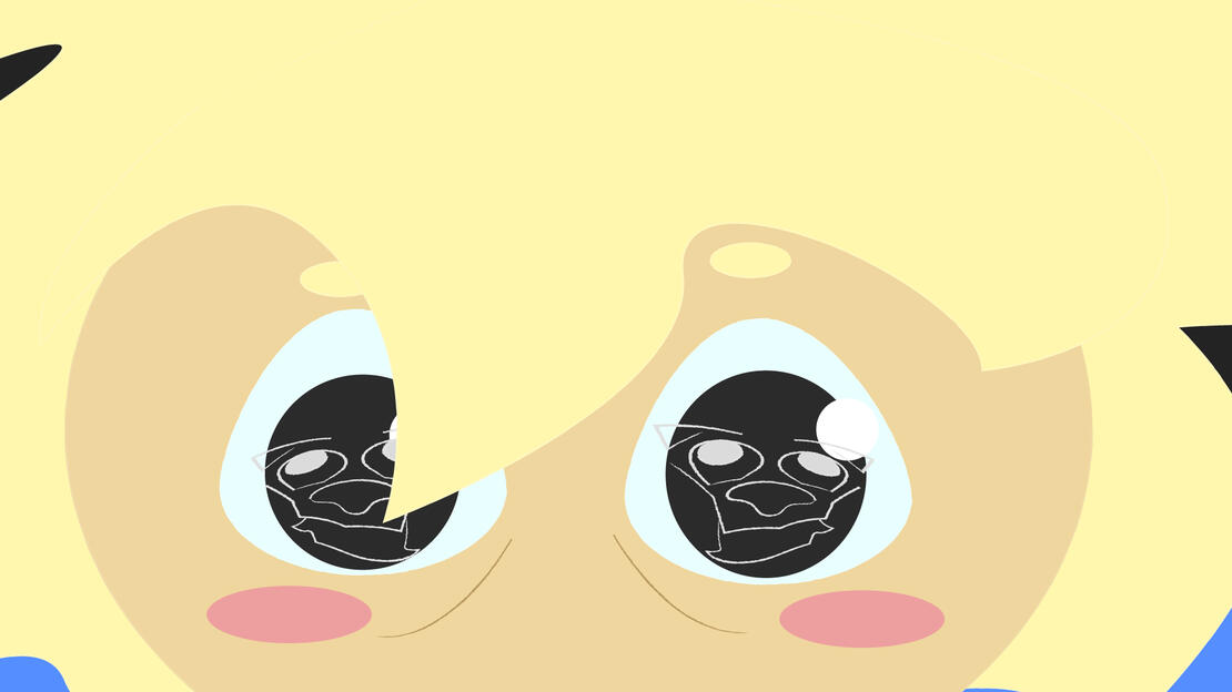
Style Frame Narrative Study


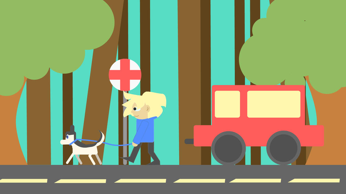
The goal for this styleframe project was to make styleframes that could tell a story in 3-5 styleframes. I chose to do a simple story on how a dog can change your life. The color change was used in a big way to visually show the difference in emotion during the before and after.
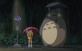
The Inspiration
The composition for the first one was highly inspired by one of the scenes in My Neighbor Totoro. I wanted the color pallet to reflect a dull world and have the main character stick out like a sore thumb.

One of the things I had to focus on with this project was if I wanted to make the dog its own frame. In the end I think the story was clear enough without it, but I still did a very rough drawing of what it might have looked like.
The Process
When starting a project I always start in Adobe Illustrator. It helps a lot to map out ideas and shapes. Once I have a proper idea I then refine the shapes and add the base colors. From there I bring it to photoshop where I can stylize and texture easily.
Motion design mixer
The Motion Design Mixer project was a minute long video that was projected onto the wall of the venue. The theme for the mixer was Vegas Night, so with that theme I came up with idea of creating a projection inspired by the Beauty and The Beat "Be Our Guest" dancing object sequence.
MOVING POSTERS
The Moving Posters project was to create a poster based on an assigned artist. For this project I got Gabriel Dawe and researched a multitude of his projects before landing on his most popular ones, his Plexus exhibitions.
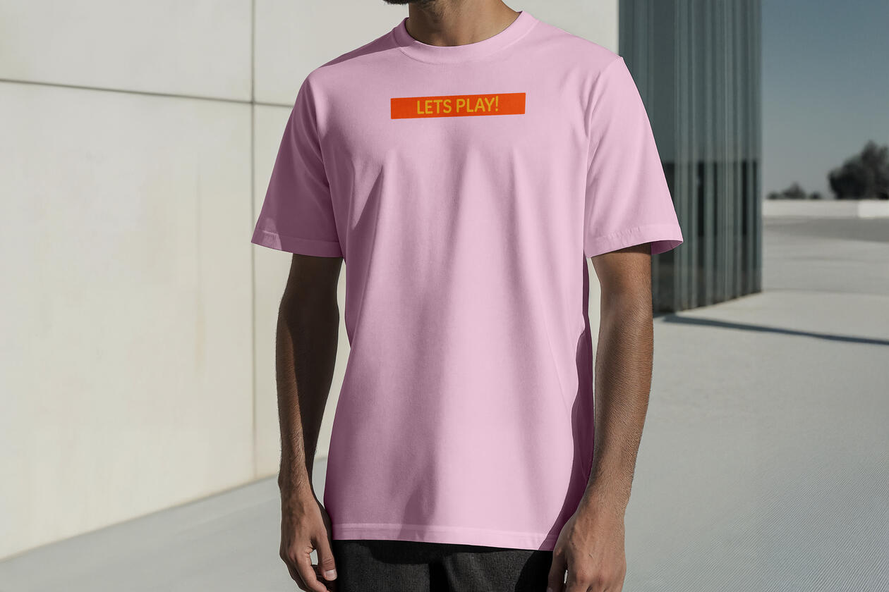
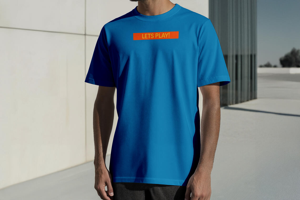
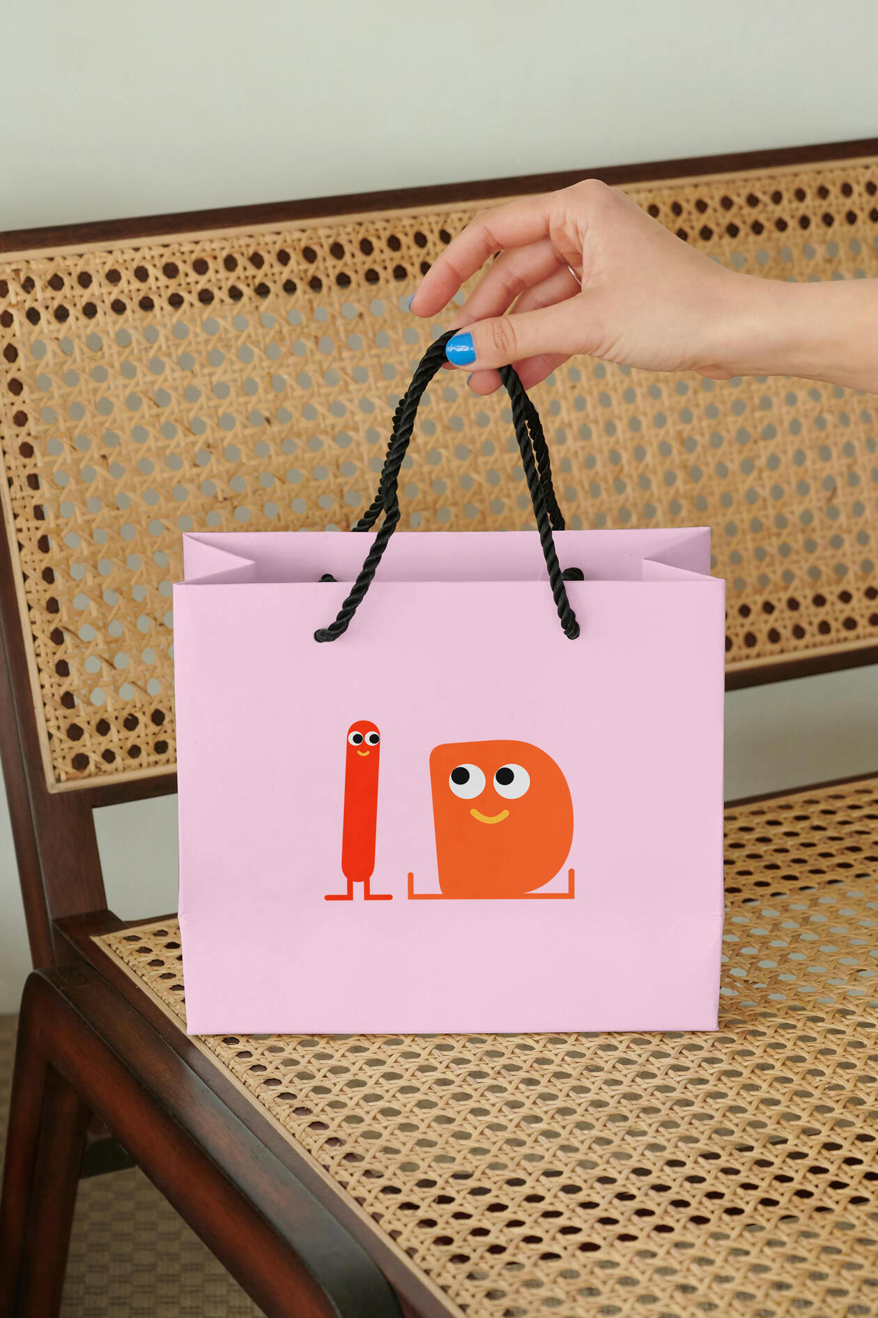
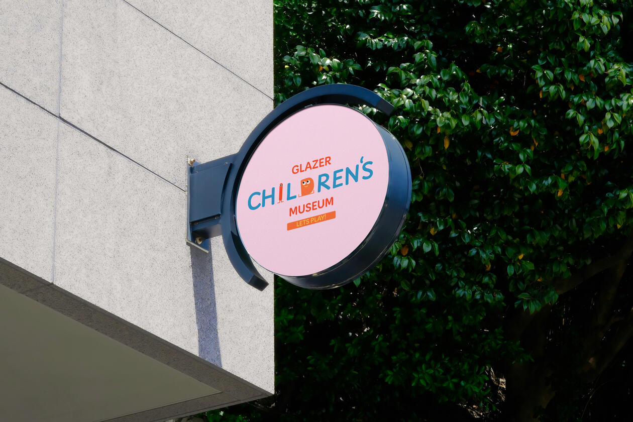
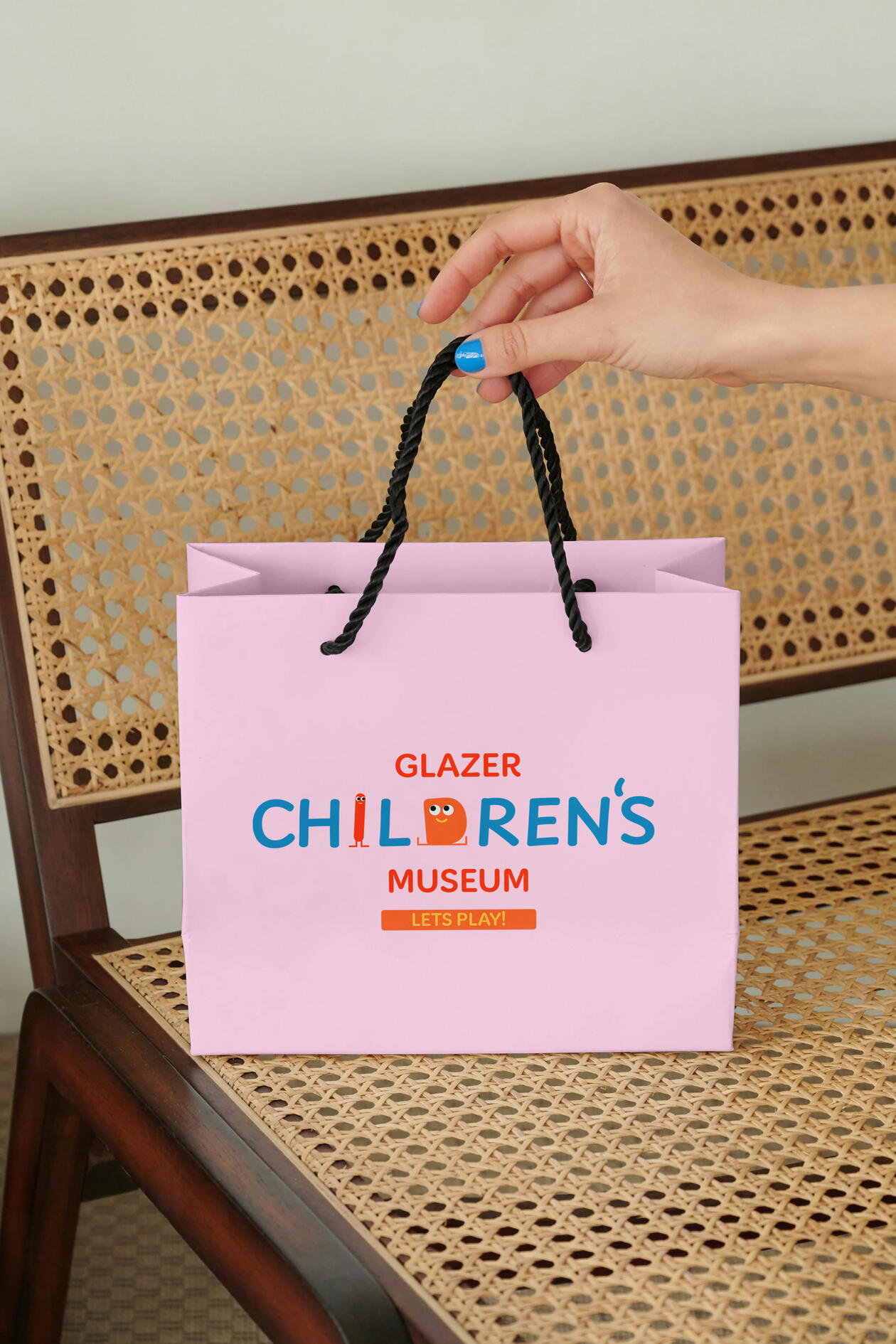
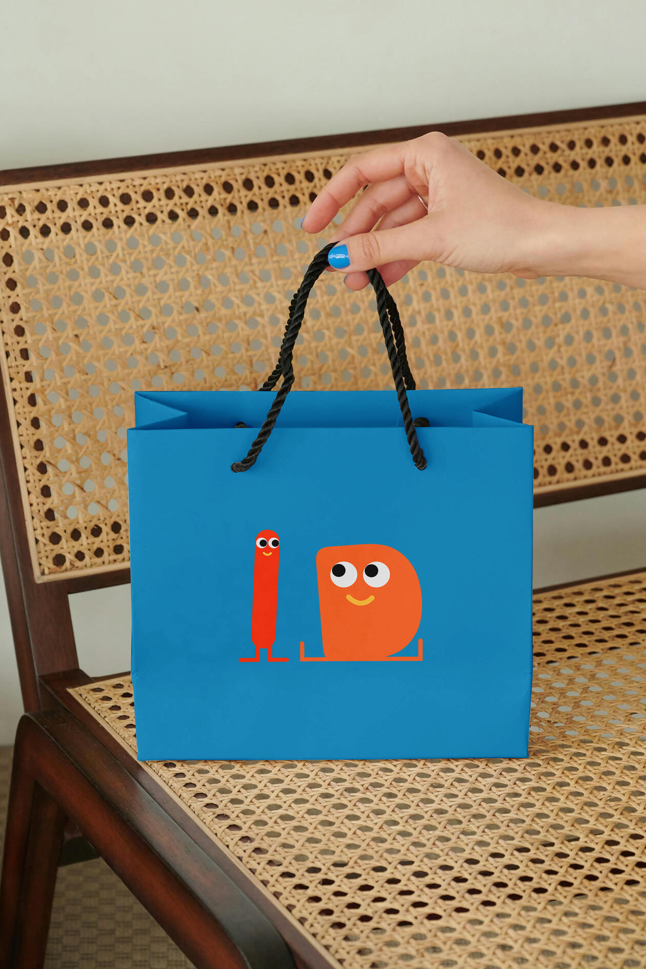
Glazer Children's Museum Style Guide
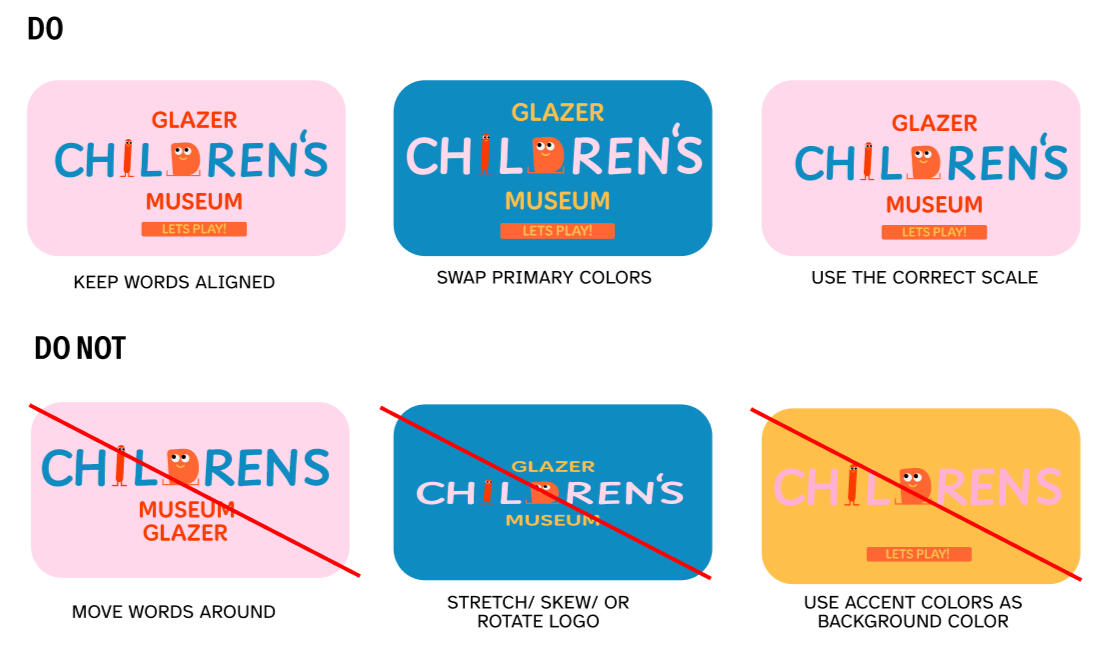
The goal with this assignment was to renew brand designs that seemed to be lacking in wither the connection to their audience or just in overall design. In this case the design seemed too mature for the intended audience (children). While the original submark was rounded, the wordmark had almost realistic children in it and it took the childlike whimsy you want out of the picture.
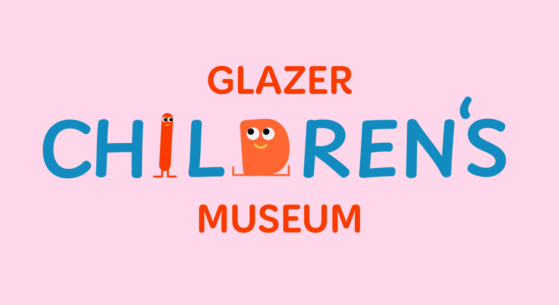
Brand Voice
Glazer Children’s Museum is a brand that should communicate a
personality that feels Cheery, welcoming, and most importantly, kid friendly. It is a brand that should invite not only children in, but parents as well.
The issue with the previous brand was that it didn’t feel as inviting as it should to children. The tagline “lets play.” wasn’t as fun as it should have been due to the period and dull purple color. With this design I wanted to bring back cheer and bring people in.
Logo Design


Primary
Secondary
Submark
Favicon


Rules
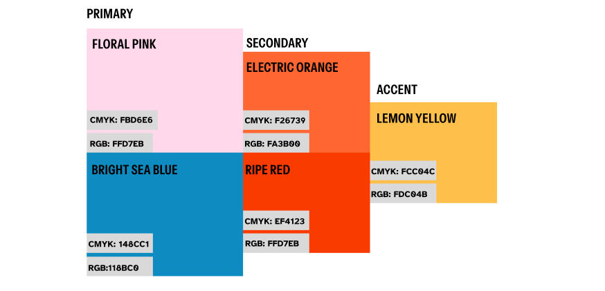
Colors
The Glazer Children’s Museum utilizes bright and childlike colors. The colors make the logo more welcoming and friendly to children and parents both.
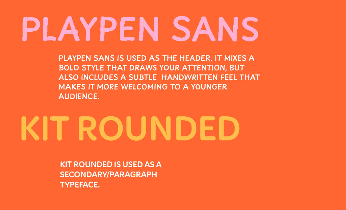
Typography
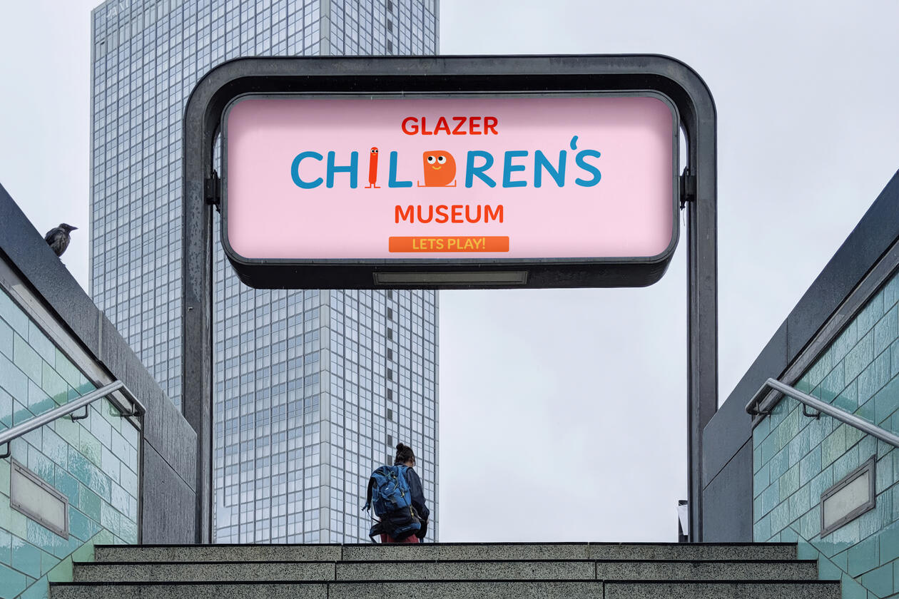
Brand In Use
Animation
The glazer Children’s Museum utilizes fast and fun motion; providing a visual and fun experience for children. The characters have subtle personality, but not enough to take away from the main title. Take care to move it in a way that the viewer won’t get whiplash.
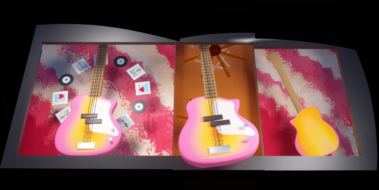
SARASOTA FRESH FRIDAY
For this project the brief was to design a one minute video promoting art in Sarasota Florida. For this project I chose to do a less promoted aspect, music. To go along with the Alan Grant band who was playing at the festival, I designed an exiting video featuring different instruments.
Designed and textured in Cinema 4D and Photoshop, I wanted to promote both the festival and sarasota as a whole. By using the instruments I incorporated parts of sarasota into their design. The guitar symbolized the ocean with waves, the bass shoed the beautiful sunsets that Florida has, and the drums the thunderstorms that frequent the city.
Some of the hardest parts of this project was one; slowing down the video to make it so it doesn't go too fast and cause whiplash for the viewer. Two; creating the correct size frame to fit on the sails of the building. Through a lot of trial and error I was able to fine a good amount of time along with designing a good frame to not break the Trompe L'oeil effect I were going for.
Medium Frame Study

The goal of this project was to create a style frame based on an article titled "Teaching During the “Rise of AI” and the “End of Reading”" by Eric Sentell on Medium.
Ideation
While looking at Mediums style guide I noted that they have an overall clean style, however the images that often went along with the articles typically looked more like stock images. That typically works, but because it is such a heavy topic it seemed like I could step a bit out of bounds for this.This frame is intended to be seen on the web through the Medium website and through its daily marketing emails. Viewers will primarily be sitting at their desk on their work computers.
The process
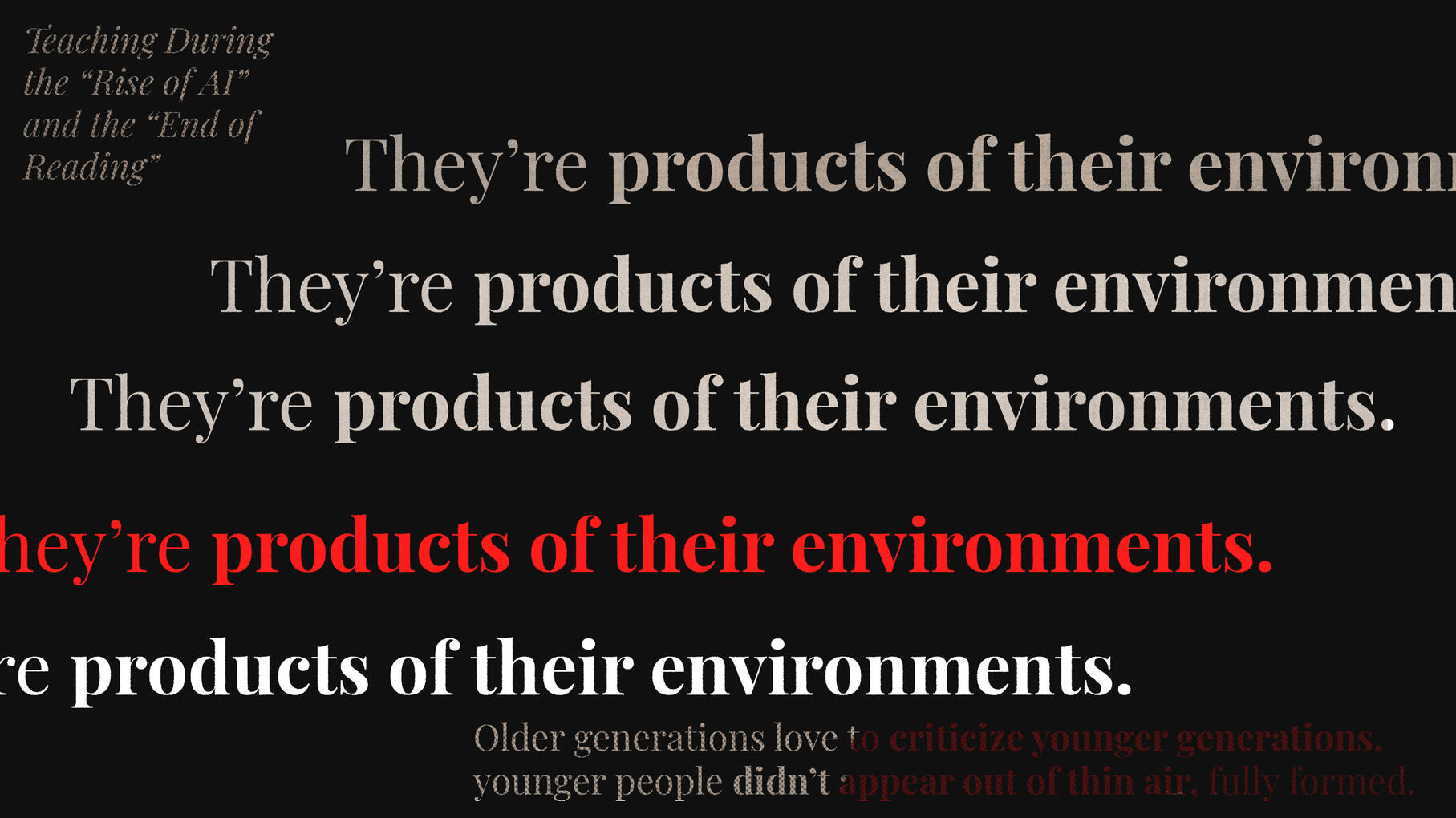
The original dilemma was transferring quotes from the article into a tasteful layout in the style frame. I knew I wanted to include the title of the article, a powerful quote and the end idea. I ended up with this simple style frame.
The next part was deciding on a style. With this I knew I wanted to go with grunge because the content of the article is so serious that the frame should make you want to look at it.
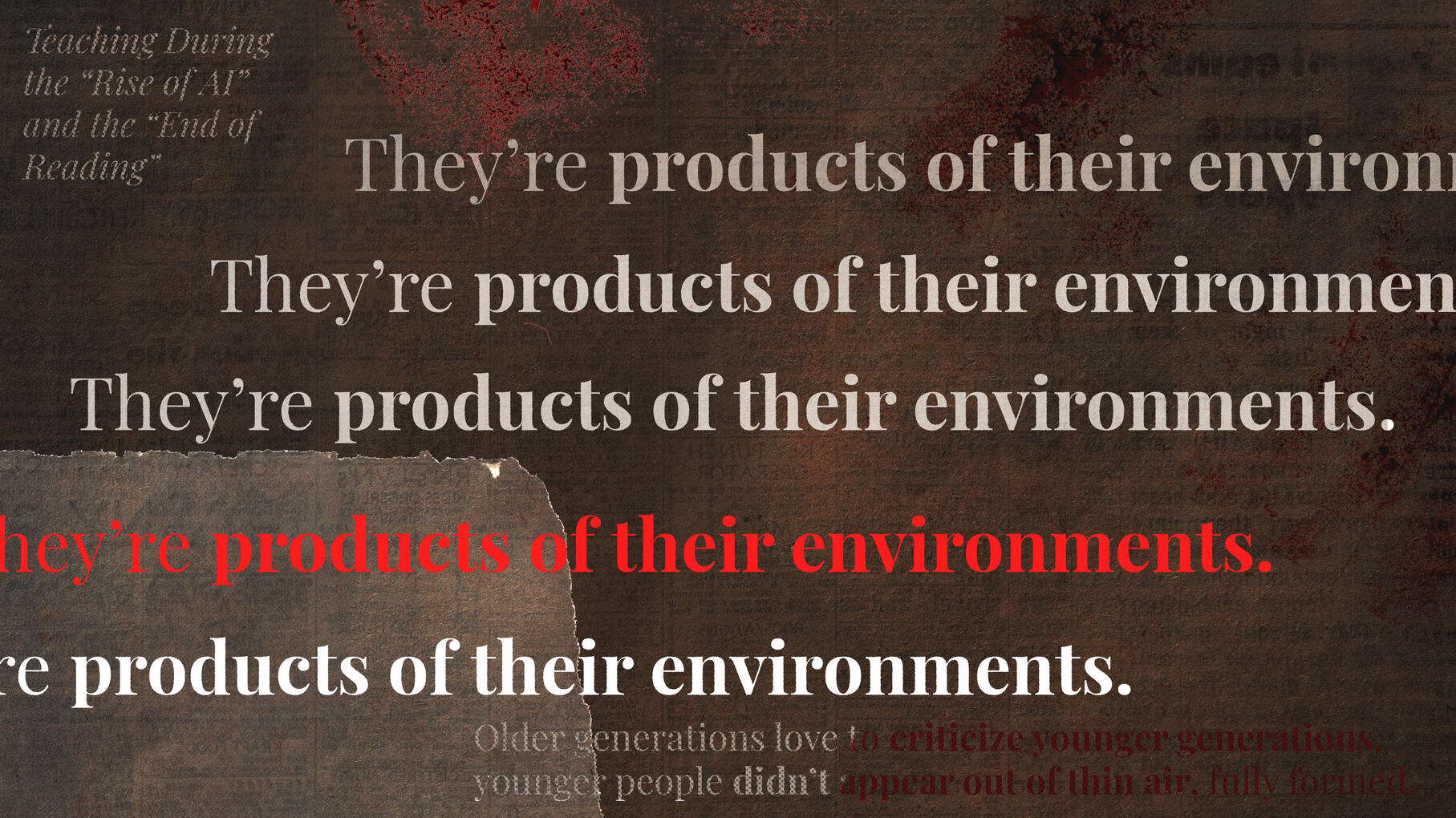
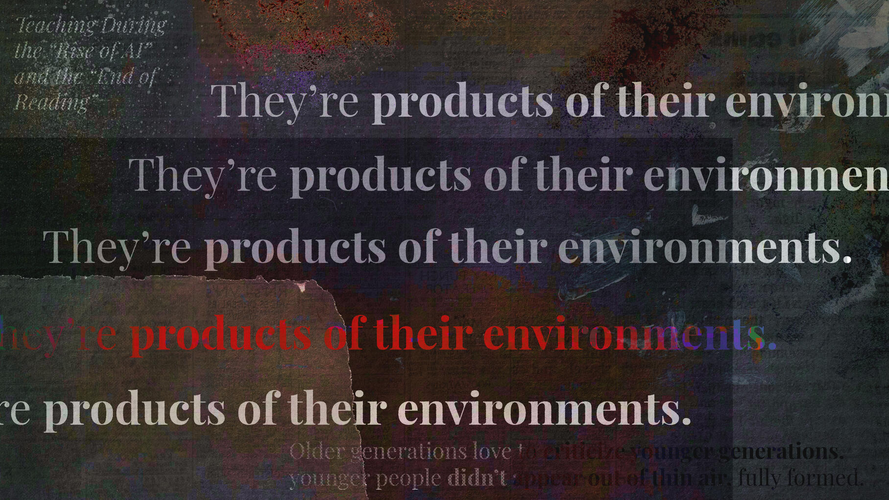
After that I used overlays and human like elements to make the frame scream "human". I chose to do this because the some of the content in the article is about AI taking over human creativity.
After that I added small elements that made certain parts of the frame pop while filling in some of the blank space with interesting content that won't draw your eye first.
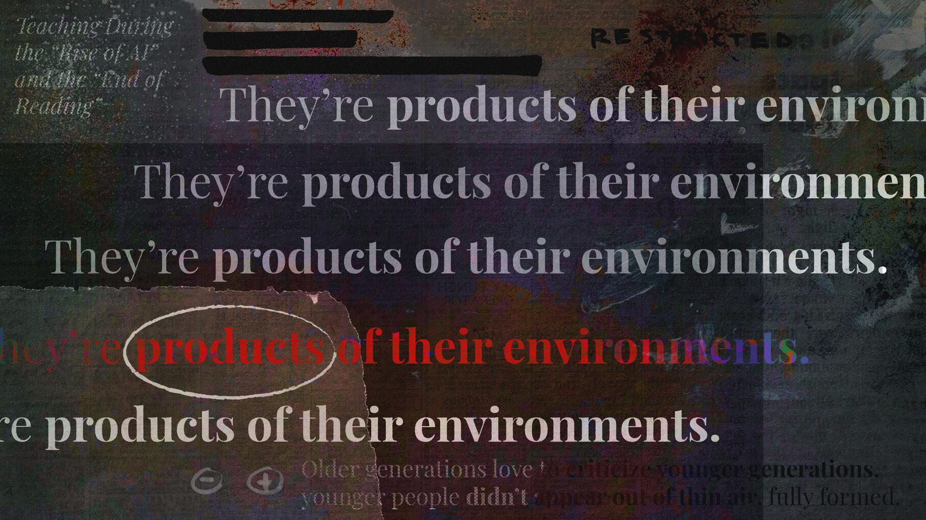
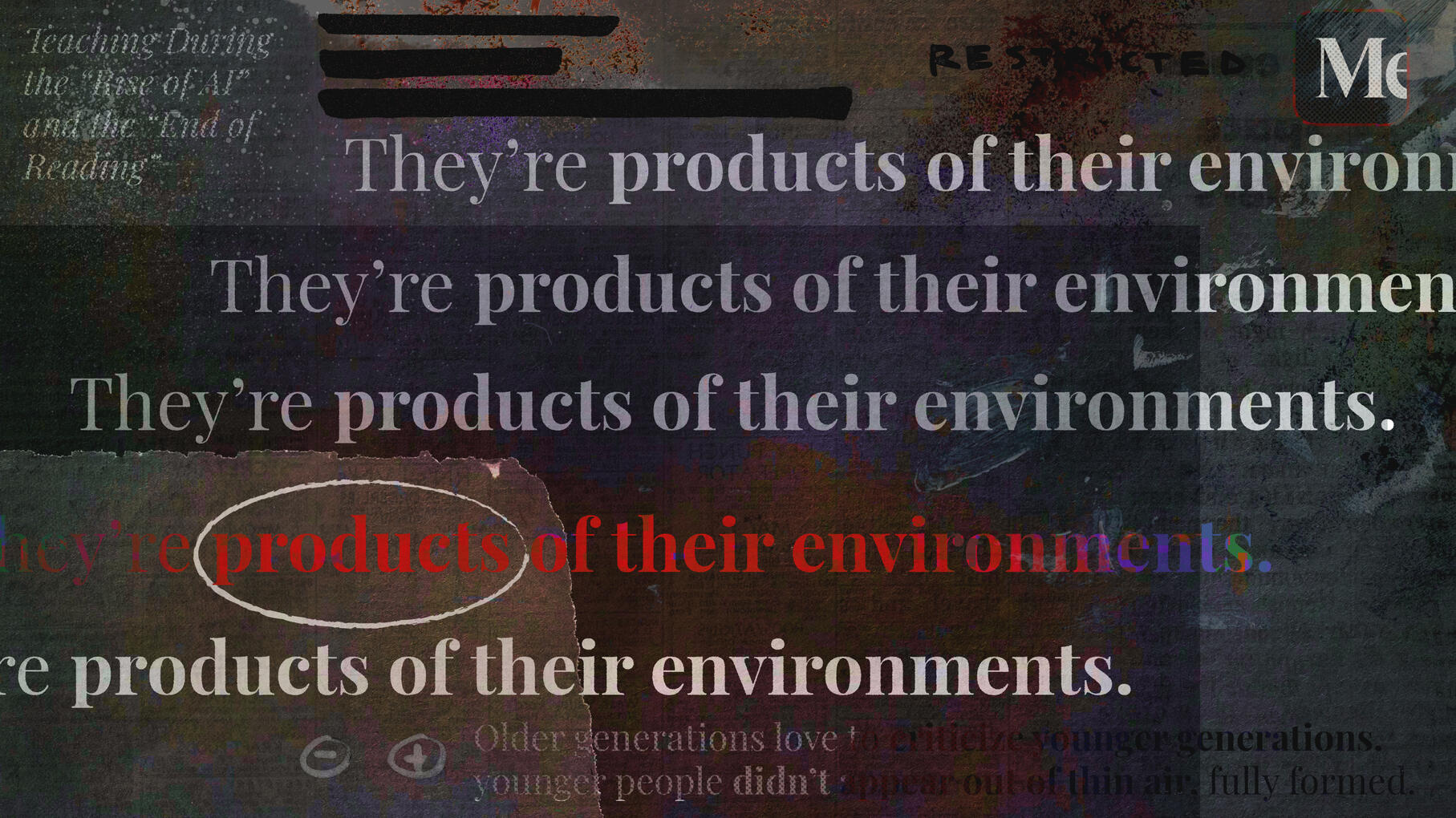
The final touch was adding the Medium logo in the top right corner!
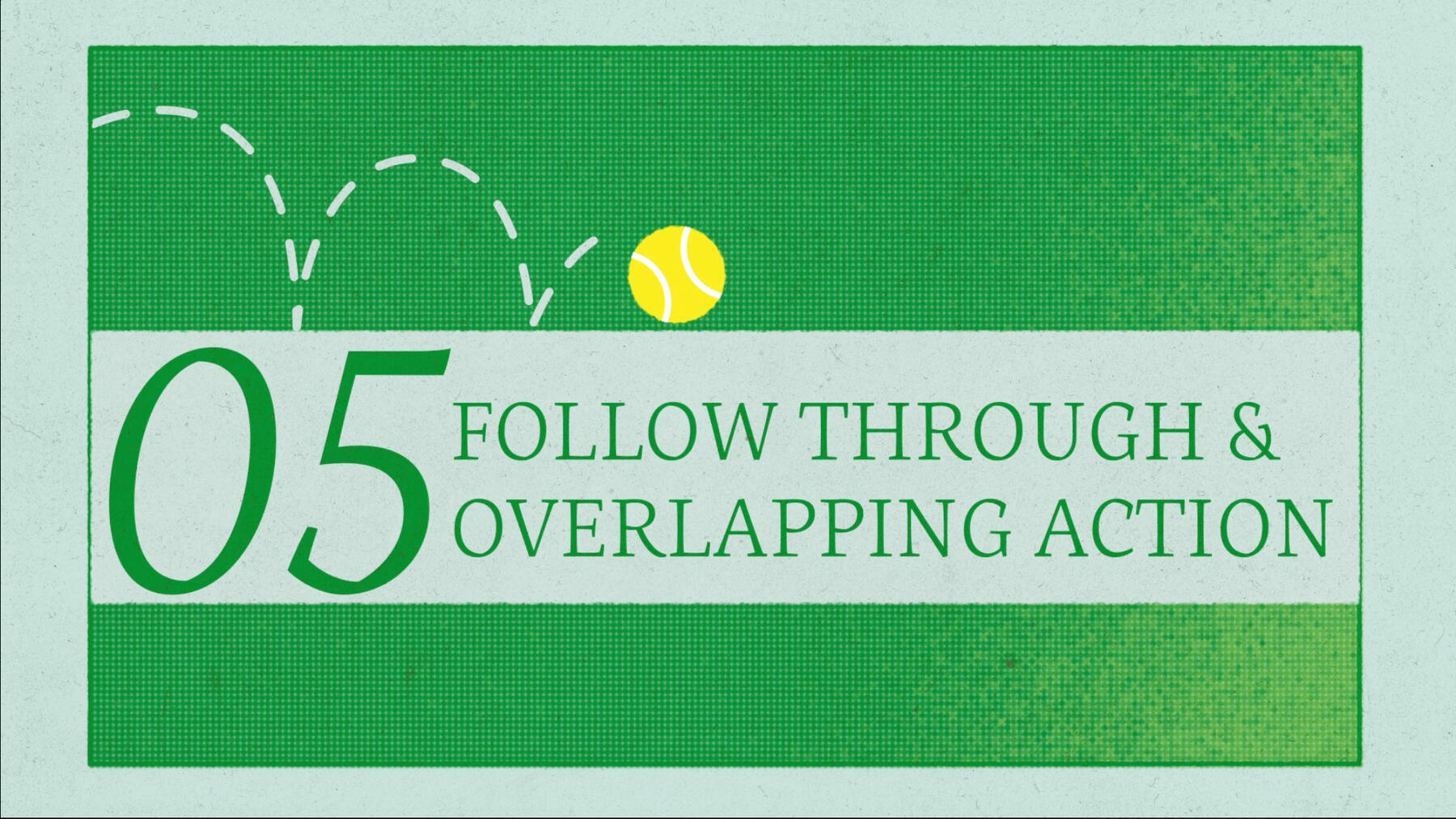
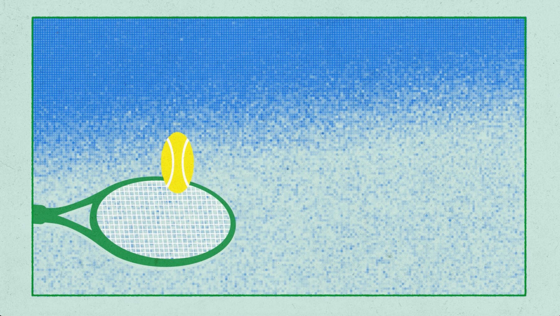
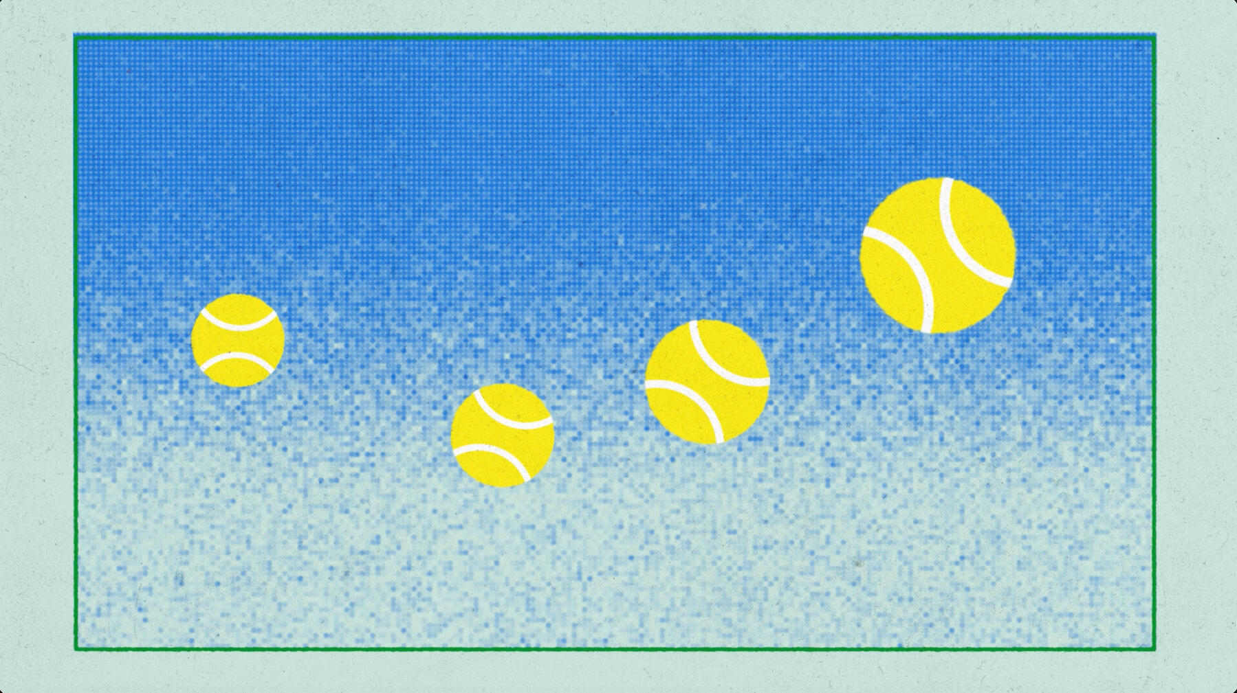
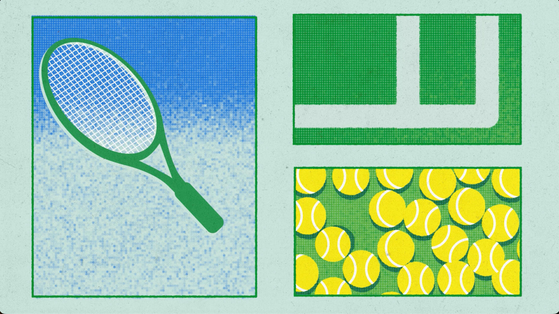
THE 12 PRINCIPLES OF ANIMATION
The 12 Principles of Animation was a four person group project with the goal of creating an animated explainer video. We had to not only have audio explanations, but animation that clearly showed key ideas seen in each principle.

IDEATION
The focal point of this project had to be one thing- an object that was a ball or ball like. With that in mind there were many directions that we could go in. Many people decided to go with fruit, but in the end we decided to go with a classic tennis ball.With that decided, the next step was that we needed to create a mood board.

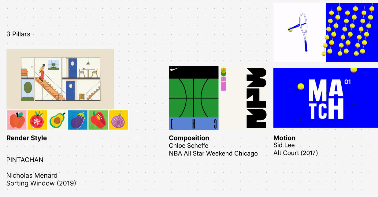
For this project there were many rules within the design. The only angles we decided we could use was either an aerial view, or a side view. We also decided early on that we wanted to use containers for the content as seen in the Sorting Windows reference.
The hardest part of this whole project was trying to figure out what to do with the sky background. We went through many different itereations until we ended up with the final product.
The Design
I was in charge of the design and animation for the principles Squash and Stretch, Anticipation, and Overlap and Follow Through. In addition each member of the group had to create a main title card, a end title card, as well as a title card for each principle. Many of the designs ended being up overly simple, but still tasteful, because the whole point of the short was to showcase important factors in animation.
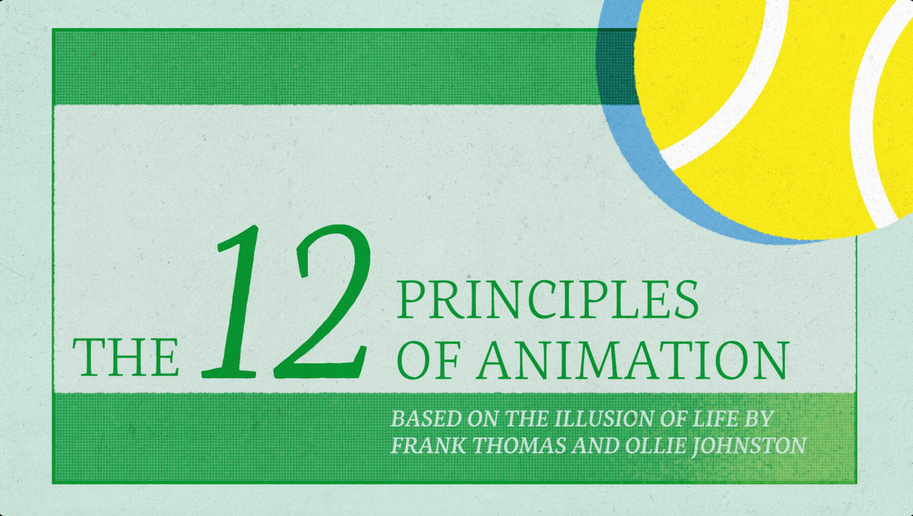
The Animation
The animation was overall the most important part of the assingment. We all had to agree on the stretchiness of the balls and how fast we wanted the motion to move. One of my favorite parts in the animation was when the ball went very fast, it would gain an echo track behind it.
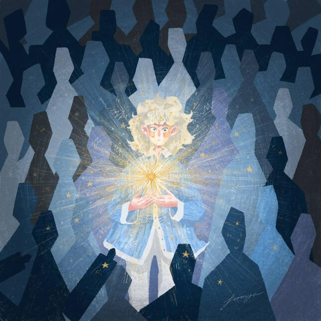
Be The Change

This style frame was focused on the idea that in modern age, many people look the same way, the main perpetrator of this being technology. I wanted to show this through the use of TVs as peoples heads. All of the people but one are looking the same way. The one who is looking the other way seems to have broken out of the loop and is breaking free from the
repetitive nature of life.
MOODBOARD
As seen in the mood board, a lot of the work had visuals of repetitive features and great contrast. I wanted to implement this within my styleframe to create a great contrast to clearly show the message.


The first part of this process was to design the scene in 3D. This involved modeling the TV, the form, and deciding the content within the TV's.
The next part of the process was deciding the layout. As seen above, I implemented a more forward angle, however I found it to be too plain. I decided to attempt to make it more visual interesting with a fisheye angle.


Next I had to decide how to display change in a greater way in my work. My first idea was to use contrast through color as seen in the moodboard above, however it got rid of more of the technological feeling I was looking for.
Lastly, I decided to do some adjustments to the levels and add some drawing to the piece to make it seem like creativity is flying out of the TV.

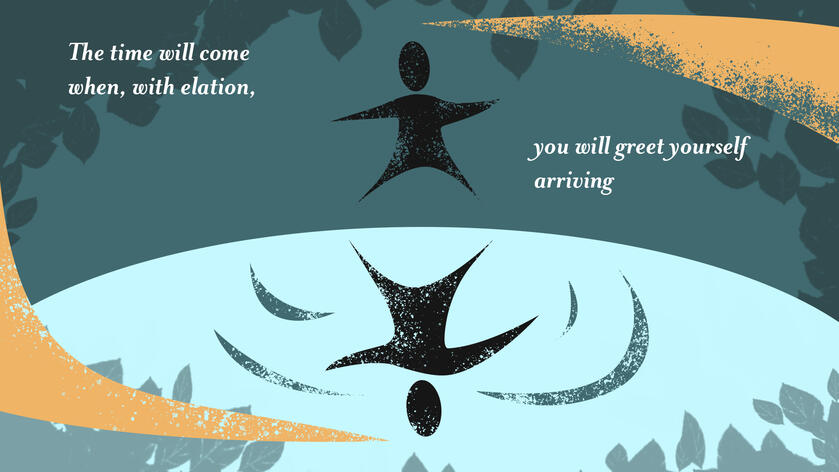
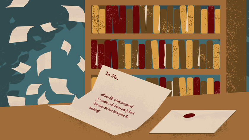
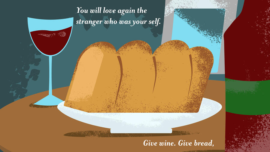
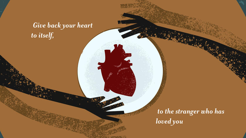
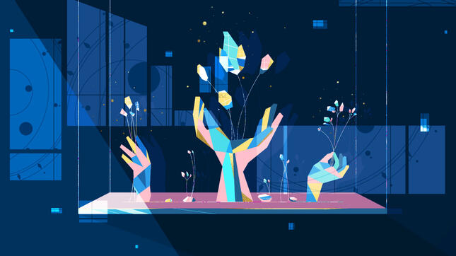
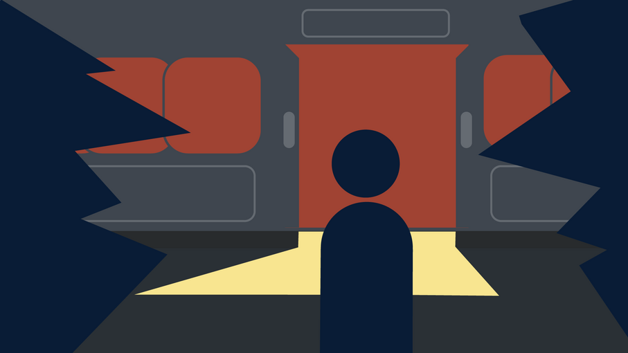
Love After Love Styleframes
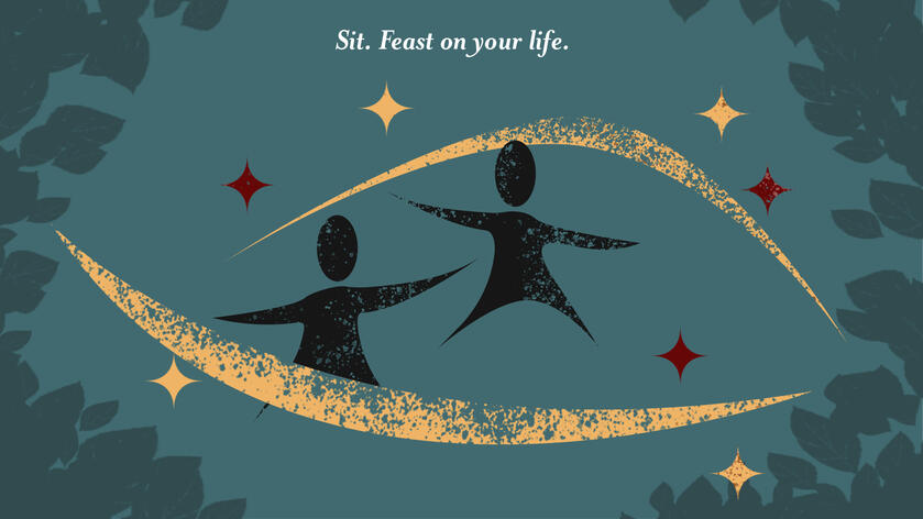
Poem By Derek Walcott


Love After Love is a poem by Derek Walcott. Originally published in 1986, this poem was written to implore the importance of loving yourself to the reader. The goal with this was to take visual cues from the poem and transform them into their own individual style frames.
Inspiration
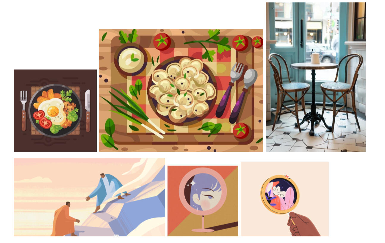
With this project I wanted to create the original assets with a more vector like style. A lot of the inspiration comes from flat vectors and simple lighting.In addition, I wanted to put a twist by adding my own style to it. I really enjoy a more textured piece, so I decided to add a grunge finish to the piece.
PROCESS


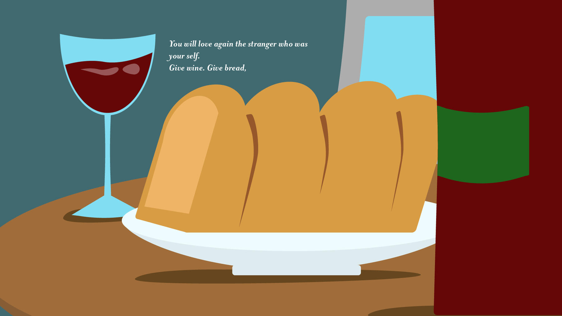
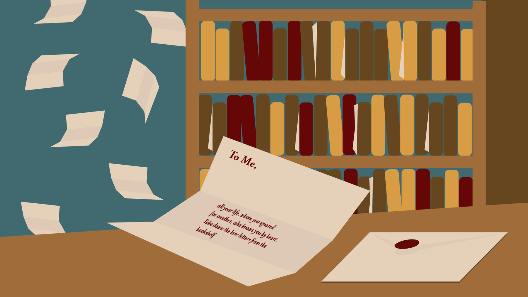
As stated before, I began this project with making all of the assets in a vector style in Adobe Illustrator. This process made it easier to use repeated shapes and helped make the pieces look more unified.
One of the main issues in designing this piece was the fact that there were so many different ways to interpret the poem. One of the largest issues was the first part where the reader "greeted" themselves. I made various iterations of this before landing on the one in the final.

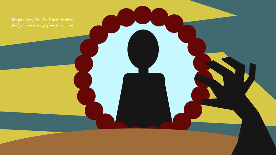
After designing in Illustrator, I moved the final product into Photoshop. By utilizing clipping masks along with the vector, adding consistent texture was simple and quick.